built to replace manual vigilance with system-led reliability
Elo
a finance-critical system that scales with accuracy.
client
Subvisual
timeline
10 weeks・2025
scope of work
product design ・UX research ・branding
project type
fintech・web app
overview
when financial accuracy depends on people, growth becomes a risk
Elo is designed to support Subvisual’s internal operations across finance, leadership, and delivery teams. Built as part of a structured apprenticeship, the project involved designing an internal product in close collaboration with finance and engineering stakeholders, focusing on creating a shared system that remains reliable as financial complexity and access increase.
problem
This project tackled a common scaling problem in finance-critical systems: accuracy that depends on people rather than the system. At Subvisual, financial workflows worked, but only because errors were manually caught before they compounded.
solution
Develop a desktop financial management app organised around reconciliation as the core principle, structuring workflows to prioritise clarity, review, and control. By embedding safeguards directly into the system, it enables safe cross-role access, reduces reliance on manual oversight, and provides a scalable foundation for finance-critical work.
process
success
The success criteria weren’t fully defined on day one; they emerged through early discovery and stakeholder conversations. I defined success in terms of outcomes, not features:
Accurate reconciliation with less manual oversight
Safe access across roles with different financial literacy
Eeduced cognitive load when reviewing and reporting data
Clear visibility into company and project health for leadership
Some of these goals were intentionally in tension - particularly simplicity vs finance-heavy workflows and speed vs safety. Designing Elo meant making explicit trade-offs rather than trying to optimise for everything.
discovery
talking to users made it clear the problem wasn’t tools, but trust
To understand how financial information was managed and shared across roles, I conducted 5 in-depth user interviews with finance, leadership, and engineering stakeholders. Sessions focused on walkthroughs of the company’s existing spreadsheet-based workflows, surfacing where friction, errors, and uncertainty emerged in daily work.
These interviews reinforced that users weren’t asking for better spreadsheets or more automation. they needed a system they could trust, understand, and grow with.
Key questions I asked:
How is financial data currently managed and shared across roles?
Where do friction, errors, or inefficiencies occur in daily workflows?
How do users access and trust the information they rely on?
What factors influence whether they adopt or abandon financial tools?
user’s pain points
1. workflow connection & efficiency
Invoices and documents are linked manually
Finance is a bottleneck for access and validation
Ad-hoc channels cause confusion and duplication
2. data accuracy & trust
Manual checks lead to cascading errors
Inconsistent classifications break data integrity
Accuracy depends on individual vigilance
3. clarity & communication
Financial data is scattered and hard to interpret
Reports are manual, slow, and inconsistent
Non-finance users fear touching the data
4. system adaptability
Current tools can’t flex for crypto or new models
Automation fails without clean, consistent data
Spreadsheets make scaling fragile and risky
how existing tools failed to support real workflows
An analysis of existing financial tools surfaced consistent gaps across the market. While most platforms handled financial data accurately, they were difficult to interpret outside accounting roles. High-frequency workflows such as cost allocation and splitting were often complex, error-prone, and reliant on manual workarounds. Emerging workflows, including wallet transactions and multi-project expense allocation, were poorly supported, forcing teams to stitch together multiple tools.
This analysis clarified what not to build: feature-heavy platforms that increase complexity without addressing how trust, access, and reconciliation are distributed across roles.

define
prioritising a trustworthy foundation over feature breadth
I facilitated a cross-functional brainstorming session with designers, developers, product owners, and product managers using the lotus method, which helped expand the problem space before converging on a focused set of feature ideas.
Rather than competing on feature breadth, I prioritised where usability, trust, and business value intersected. Working closely with engineering, I aligned user impact, feasibility, and time constraints to define a focused MVP.
Reconciliation was treated as the primary job of the system. Automation, edge cases, and secondary workflows were deliberately deferred to protect trust, reduce engineering risk, and ensure a solid foundation. This meant saying no to tempting additions in favour of clarity, safety, and control.
effort vs impact matrix (full matrix)
Matrix was created collaboratively with engineering to assess feasibility alongside user and business value, helping ground prioritisation decisions in real delivery constraints.
low-effort / high-impact quadrant (MVP focus)
This quadrant became the focus for the MVP, allowing to deliver meaningful value early while protecting the system’s foundation.
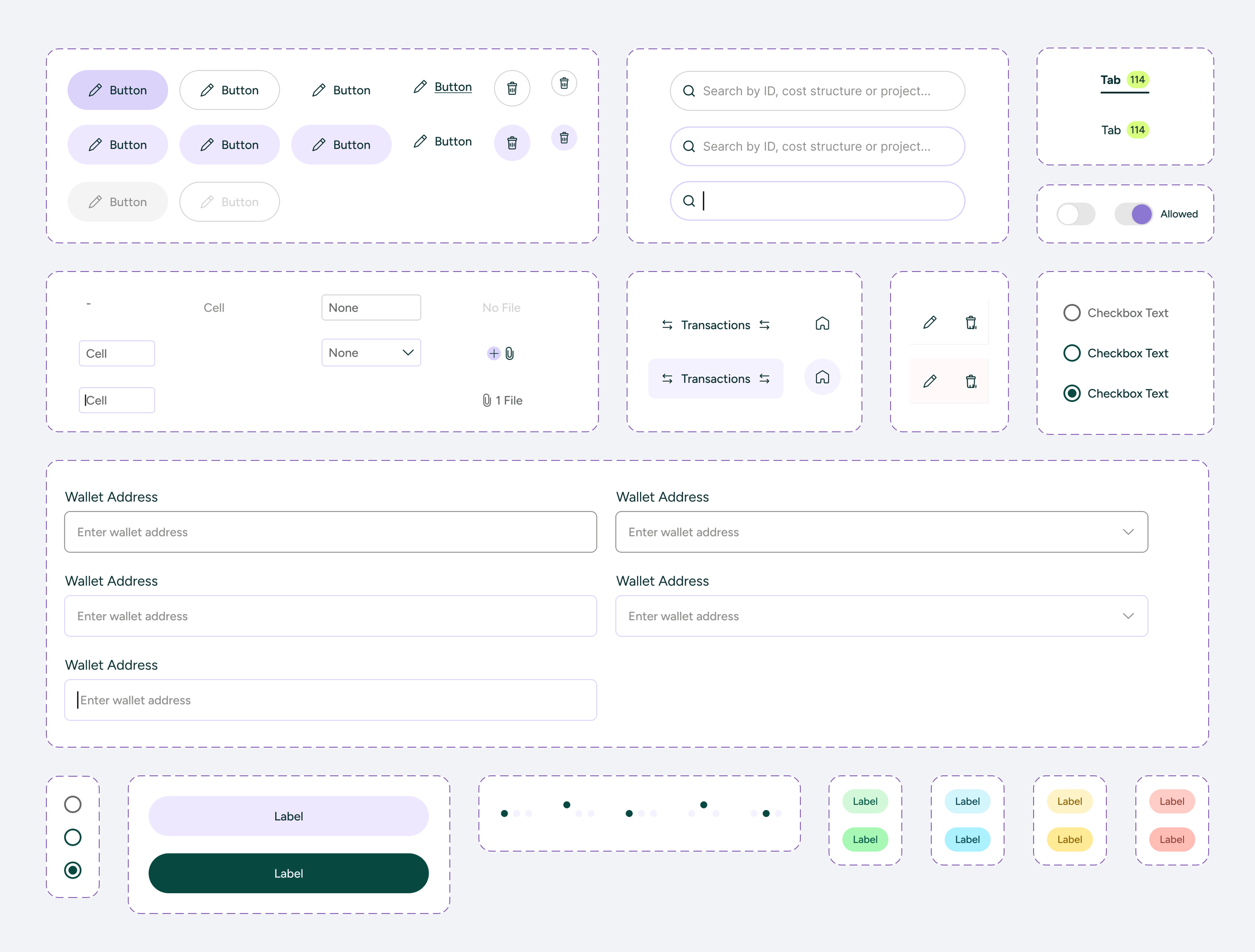
feature list grouped by similarity (IA exploration)
This grouping revealed natural relationships between concepts, making it easier to see how the information architecture could take shape and evolve over time.
design
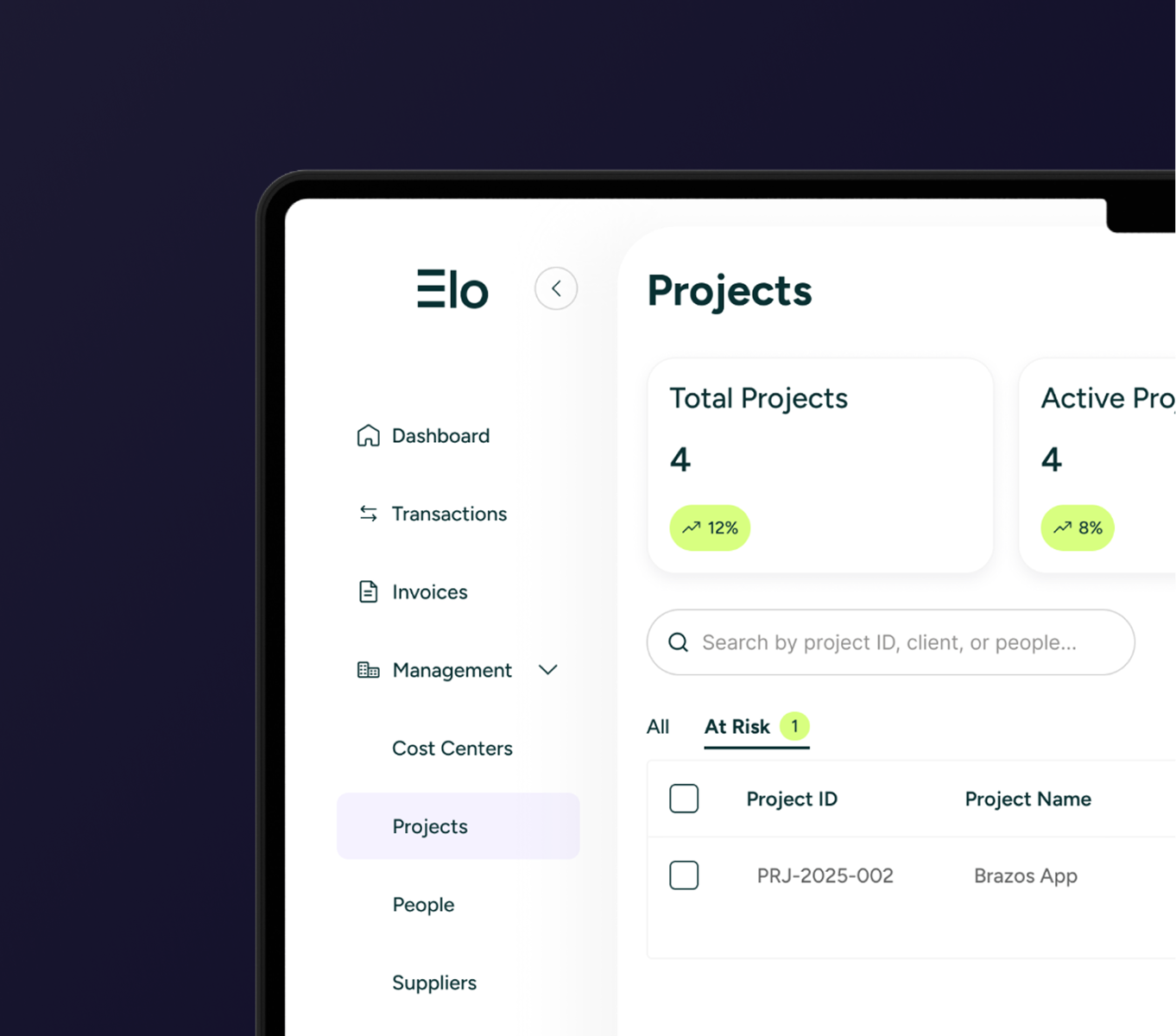
designing structure around financial risk, not screens
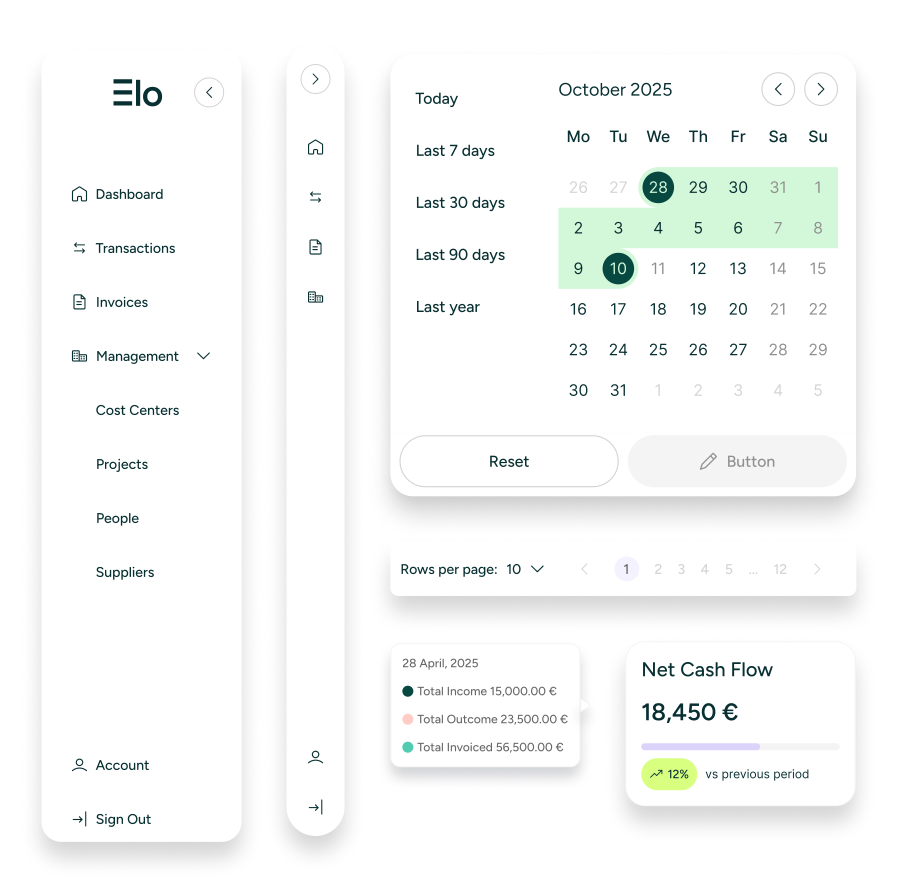
The site map was the first concrete translation of these decisions into product structure. Navigation was organised around the core financial flow: importing, reviewing, and reconciling data with supporting areas intentionally separated to reduce cognitive load.
High-frequency, high-risk workflows were elevated and made difficult to bypass, while configuration and secondary actions were kept out of the critical path.
Sitemap reflects both the MVP focus and the wider product vision. Greyed-out sections indicate features deliberately excluded from the MVP while remaining part of the long-term product scope.
mapping the edge cases before they became failures
In parallel, I mapped dense end-to-end user journeys to surface edge cases, irreversible actions, and risk points. These journeys weren’t designed for visual presentation, but to pressure-test assumptions and validate where guardrails were required.
The outcomes of this work are reflected in the structure and interaction patterns of the designs that followed.
End-to-end flows across sign-in, reporting, transactions, invoices, and management.
pressure-testing core workflows through low-fidelity testing
Low-fidelity wireframes focused on validating structure and workflows rather than visual detail. Design decisions at this phase were shaped closely by engineering constraints to ensure feasibility and reduce rework later in the process.
Moderated, task-based usability testing focused on validating whether users could complete core financial workflows safely and confidently, before investing in visual polish. The goal was to surface structural, terminology, and workflow risks that could undermine reconciliation and trust in a finance-critical system.
Testing was conducted with 4 internal participants representing different levels of financial involvement.
Testing indicated that core flows were directionally strong and aligned with user mental models, but several high-impact structural issues needed to be resolved for the system to support real operational work.
Iteration 1:
Information architecture & terminology
During testing, users couldn’t locate or understand ‘Reference Data’, and high-frequency tasks like projects and cost centres were hidden behind configuration language. This blocked task completion early and created confusion across roles.
The decision to remove ‘reference data’ and replaced it with domain-specific navigation, elevated high-frequency areas to the top level and clarified account-level versus workspace-level settings. This was prioritised because it was a systemic blocker, and fixing it unblocked multiple workflows at once.
Before usability testing
After usability testing
Iteration 2:
Editing model misalignment reduces speed & accuracy
Users tried to edit data inline, especially in high-volume workflows. The side edit-panel slowed them down and broke momentum.
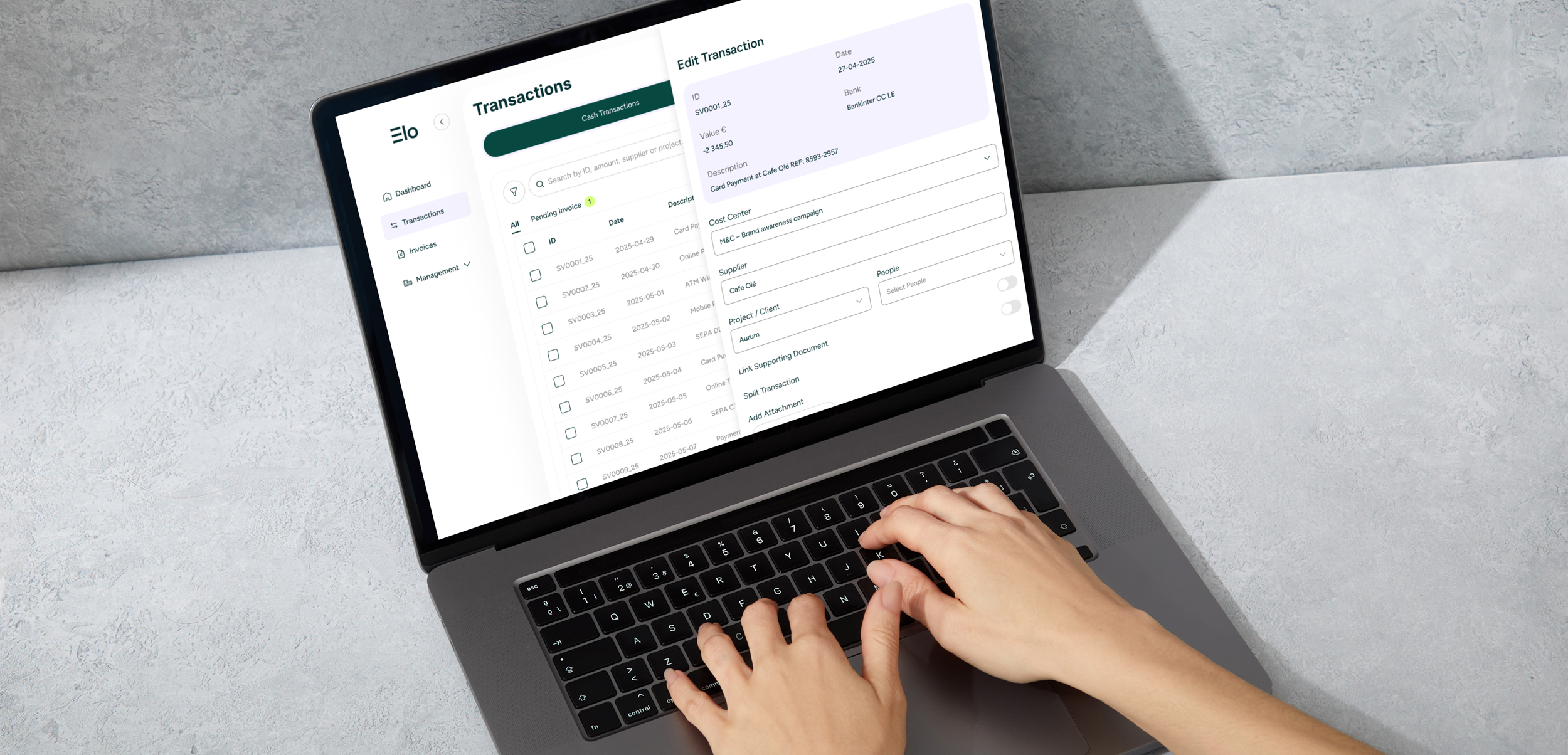
Because of this, I designed for an inline-first editing model for common actions, while keeping the side panel for multi-step or higher-risk changes. This was prioritised because editing speed directly affects accuracy and efficiency, and this approach balanced speed with safety, aligning with the core principles of clarity and control.
Before usability testing
After usability testing
Iteration 3:
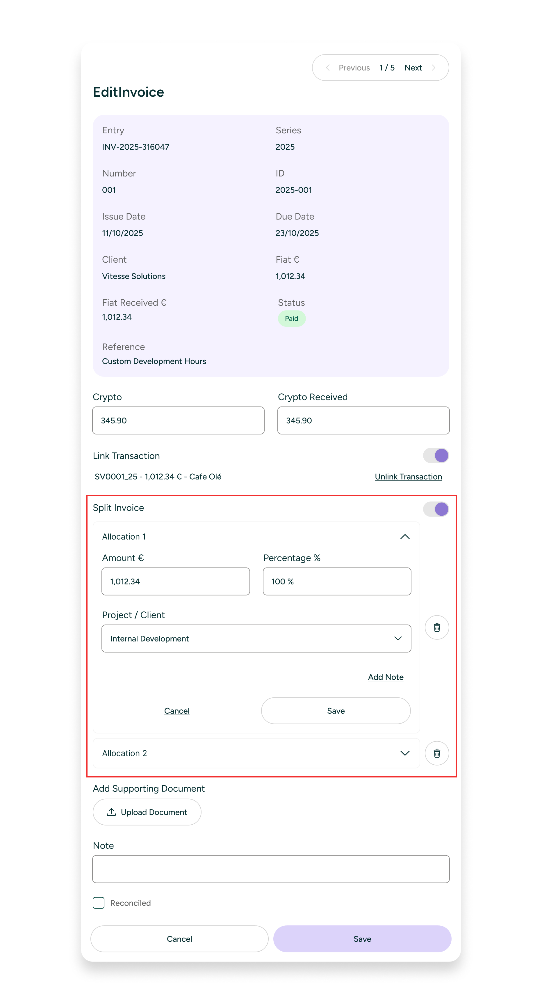
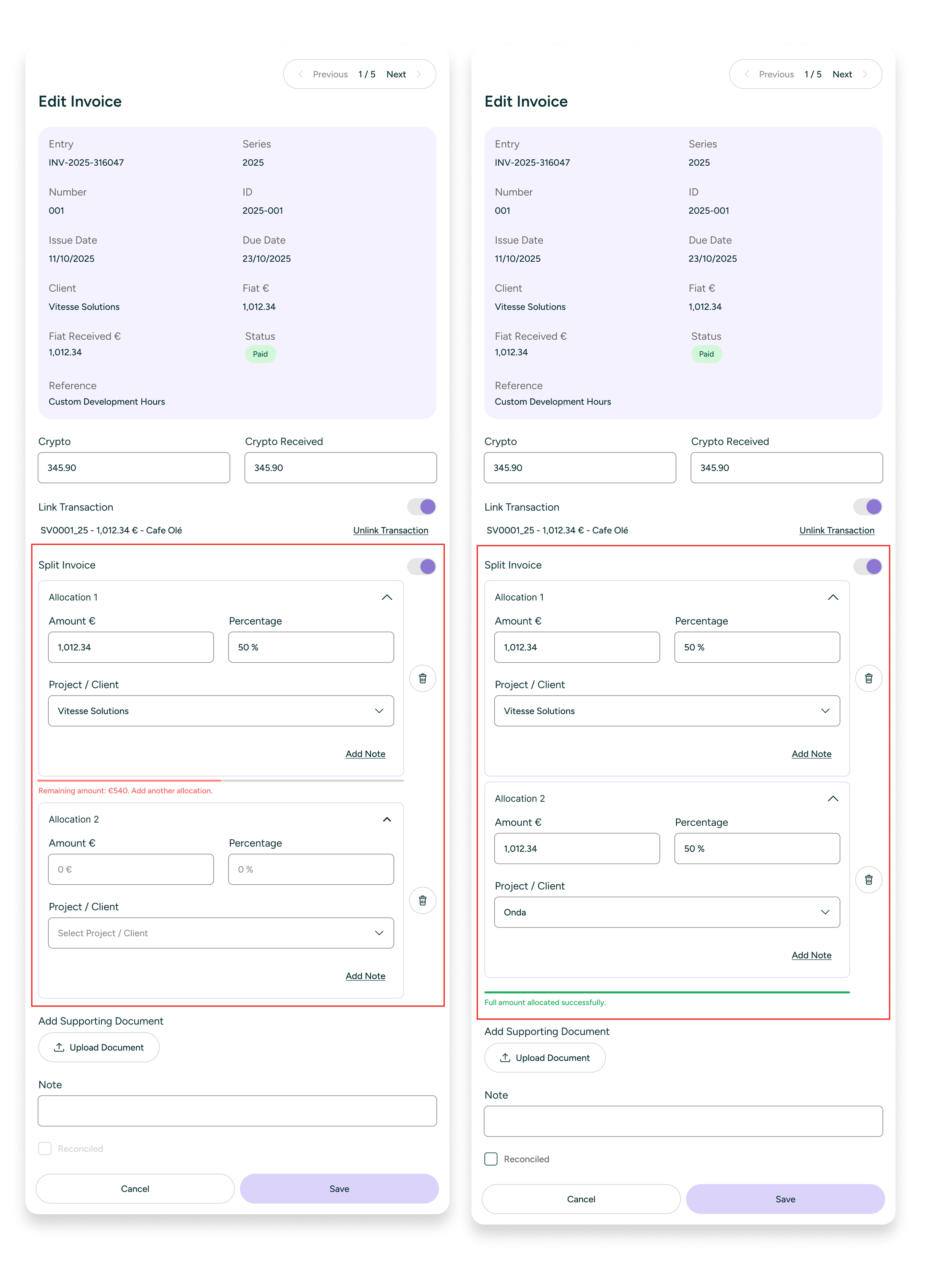
Split invoice logic
Testing showed that the split invoice logic didn’t match real workflows. Because splitting is both high-frequency and high-risk, this misalignment directly affected data accuracy.
I updated the defaults, made amount-first splitting the primary interaction and expanded split dimensions. This was prioritised to reduce manual work and error potential in one of the most critical reconciliation tasks.
Before usability testing
After usability testing
confirming the foundations were strong enough to build on
While usability testing surfaced important issues to fix, it also validated several foundational decisions. Users confidently navigated between Dashboard, Transactions, and Invoices, and understood the core flow from importing through review and reconciliation. Filtering and reviewing both data aligned with existing mental models.
This validation gave me confidence that the structure and interaction patterns were sound, which made it safe to move forward into visual design without reworking the foundations.
Core flows that aligned with users’ mental models
from validated structure to designed experience
Branding that reflects the company’s ethos:
fun people doing serious work
Once testing validated the underlying structure, the product moved into visual design. The UI was guided by a ‘friendly intelligence’ visual language - professional, calm, and approachable - designed to support collaboration without undermining trust in a finance-critical context.

test
refining the product to match real financial operations
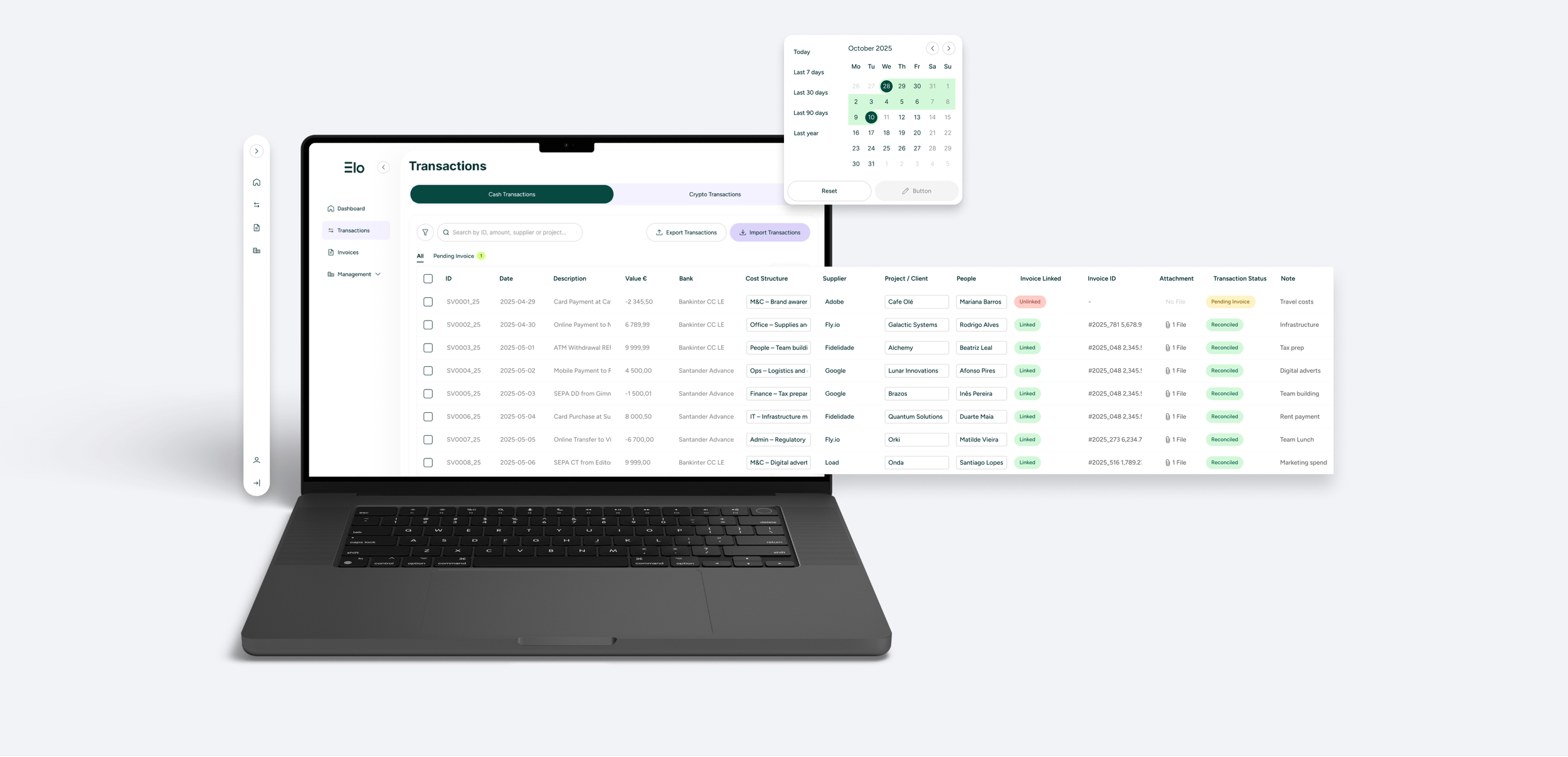
The final prototype brought together validated decisions across structure, interaction, and visual design, with key refinements after testing, such as enabling exports across cash, crypto, and invoices in a single action to better reflect real reporting workflows.
Two moderated high-fidelity usability sessions focused on whether the product could support real financial operations across transactions, invoices, projects, exports, and reporting. Testing was highly positive: users found the interface clean, intuitive, and trustworthy, with core flows aligning well with their mental models and most tasks completed without guidance.
Iteration 1:
Export clarity
Usability testing revealed that export behaviour lacked clear intent, creating uncertainty around what data would actually be shared. Users expected exports to mirror real reporting workflows, including the ability to combine multiple data sources in a single action.
The export flow was restructured around explicit modes and clearer system intent, aligning reporting behaviour with how financial data is used in practice and reducing risk at a critical point of decision-making.
Before usability testing
After usability testing
Iteration 2:
Linking logic: reflecting real finance patterns
Usability testing showed that users expected splitting to happen directly on transactions, where they already work, rather than being limited to Invoices, and needed clearer feedback when split amounts didn’t reconcile with the original total.
Splitting was moved into the transaction flow and reinforced with validation to ensure allocations always matched, reducing errors and unnecessary context switching in one of the most frequent and risk-sensitive workflows.
Before usability testing
After usability testing
testing reinforced confidence in the product direction
High-fidelity testing confirmed several foundational choices made earlier. These signals confirmed the product was directionally strong and ready for refinement rather than rework.
Navigation & structure:
Core sections (transactions, invoices, projects, dashboard) were easy to locate and aligned with expectations.
Trust-building workflows:
Import - review - confirm flow felt intuitive. The “double-check” moment before saving was perceived as a safeguard.
Editing model:
Inline editing supported speed for quick changes, while the side panel felt appropriate for more complex actions like multi-allocations
Visual language:
UI was described as simple and fresh - reinforcing trust, differentiating the product from spreadsheets and traditional finance tools
impact
the primary impact of elo isn’t a feature -
it’s confidence
At a product level, Elo replaces fragile, spreadsheet-driven workflows with a shared source of truth.
At a team level, it enables safer access to financial data across roles, reducing bottlenecks and dependency on finance specialists.
At an organisational level, it establishes a scalable foundation that reflects how Subvisual works today and supports where it’s going next.
key learnings
This project reshaped how I approach product design in operational and finance-heavy contexts. I learned that designing for ideal workflows doesn’t hold up in reality - financial data is often incomplete, delayed, or inconsistent, and good UX doesn’t try to hide that. Instead, it supports people in working through uncertainty with clarity and guardrails.
Working closely with engineering reinforced how constraints aren’t blockers, but tools that sharpen decision-making. I also learned the importance of simplifying and prioritising core workflows over completeness, even when pressure exists to add more.
Most importantly, this experience shifted my mindset from designing screens to designing systems, and from executing tasks to owning product judgement under uncertainty.
next steps
The next phase would move into development, including design handover and close coordination with engineering to translate the prototype into a production-ready system. Alongside this, broader validation across additional roles, edge cases, and real operational pressures would help ensure the product holds up in day-to-day use, with a continued focus on clarity and trust rather than premature feature expansion.
Success would be measured through behaviour: finance workflows happening inside the product by default, reduced reliance on parallel spreadsheets, and leadership engaging confidently with financial data without additional explanation.