
where creators tell their stories, and audiences discover with intention.
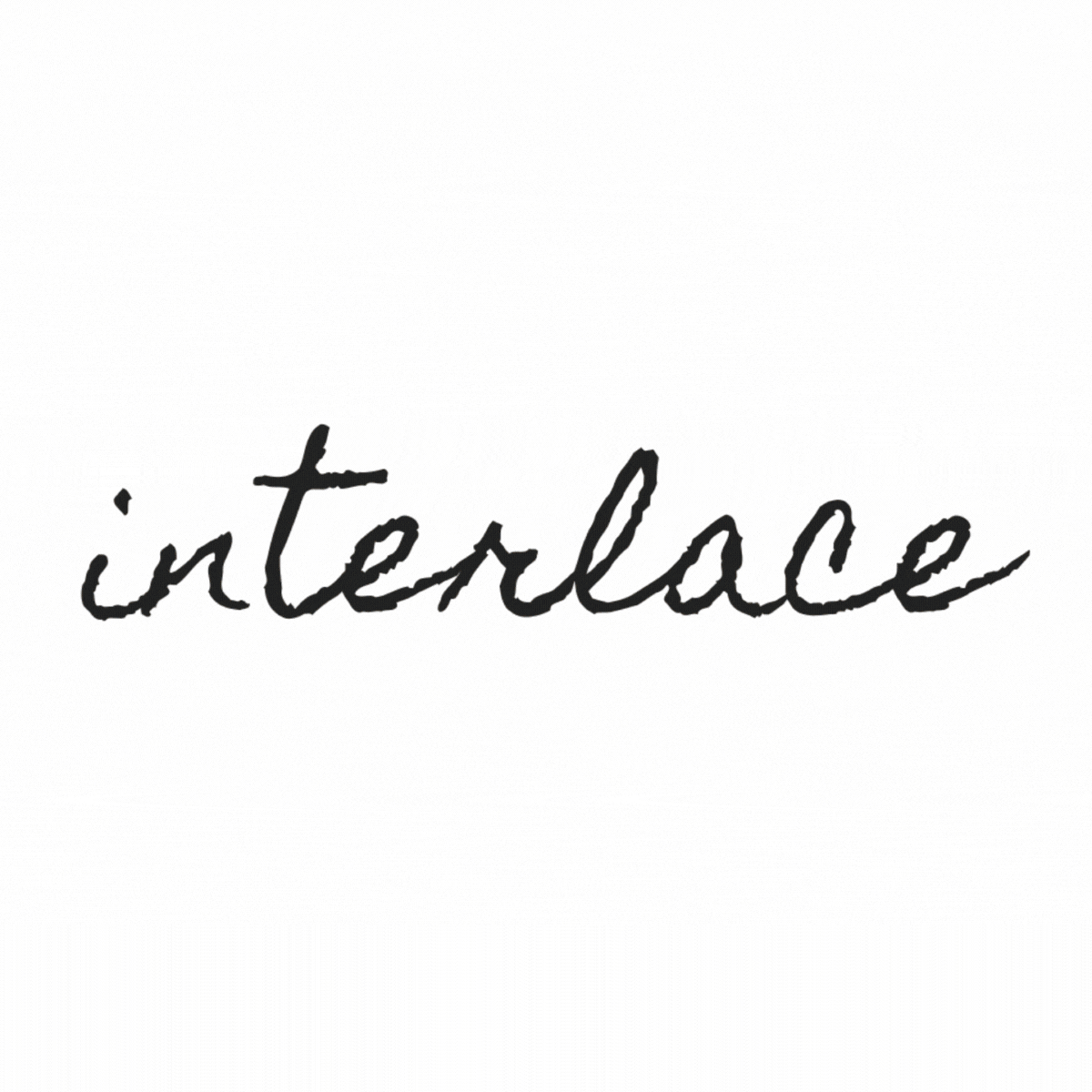
Interlace
timeline
4 weeks・2025
product design・UX research・visual identity
scope of work
responsive website
project type
overview
turning creative identity into a discoverable experience
While existing digital commerce platforms prioritise algorithmic speed, Interlace is a visual-first ecosystem built for "slow discovery." It bridges the emotional gap between fragmented storytelling and intentional audience connection, turning the creative process into the product itself.
challenge
Creators are forced to fit rich, value-driven identities into tools built for short attention spans. Audiences desire human connection but lack the interface to find it.
solution
Develop a visual-first ecosystem where process is the product. It gives creators a dedicated space to build brand depth through narrative, while offering audiences a high-intent interface to discover work based on shared values rather than algorithms.

discover
bridging the "emotional gap"
To identify why current tools fail to support meaningful creative connection, I conducted global user interviews followed by a targeted competitor audit. This multi-method approach surfaced the functional and strategic gaps that define the product opportunity.
interviews: a shared desire for "slow-tech"
I interviewed seven creators and two values-driven consumers across South Africa, Portugal, and the USA. While I expected distinct needs, I found a singular, shared frustration: Digital commerce has stripped the soul out of the creative process.
The Primary Finding: Both groups identified a significant "depth gap" in existing digital spaces, where the speed of commerce often erodes the meaning behind the work.
The Shared Friction: Participants described current tools as fragmented, forcing a disconnect between a creator’s identity (the “why”) and their output (the “what”).
The Research Pivot: These insights redefined the project’s trajectory - shifting the investigation from how creators’ display their work to how narrative context is maintained within a digital experience.
key insights
All users wanted visual, narrative-led formats that reflect the “why”, not just the “what”.
All seven creators cited algorithm fatigue and platform fragmentation as major challenges.
Creators sought tools to tell the full story behind their work, not just present the finished product.
Most creators wanted more space to educate and share context.
All audience members valued trust, transparency, and connection over polish or price.
All audience members preferred casual, honest content over polished or influencer-led campaigns.
market audit: identifying the context vacuum
With the human need defined, I analysed international competitors to understand how they handled storytelling and visibility.
The Finding: Discovery is almost universally trend-driven and algorithmic.
The Gap: There is a significant lack of values-based filtering and creative transparency. Most platforms offer a polished catalog but provide zero insight into the creator’s process or brand identity.
The Problem Space: Market leaders prioritise volume and speed, leaving a clear opportunity to investigate a model where transparency and process the primary drivers of discovery, rather than an afterthought.
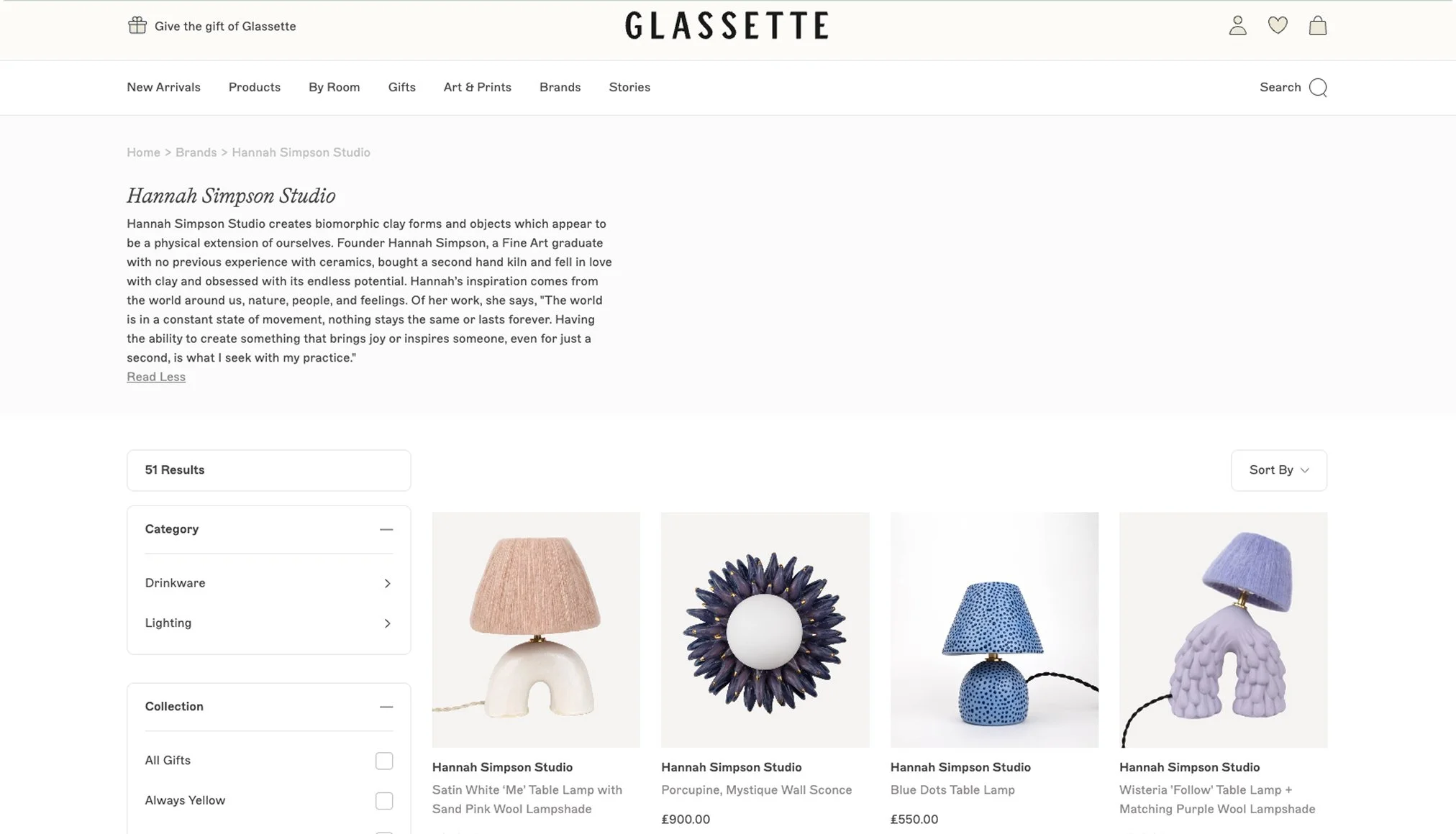
Glassette showed strong visual style but minimal space for behind-the-scenes context or brand identity.
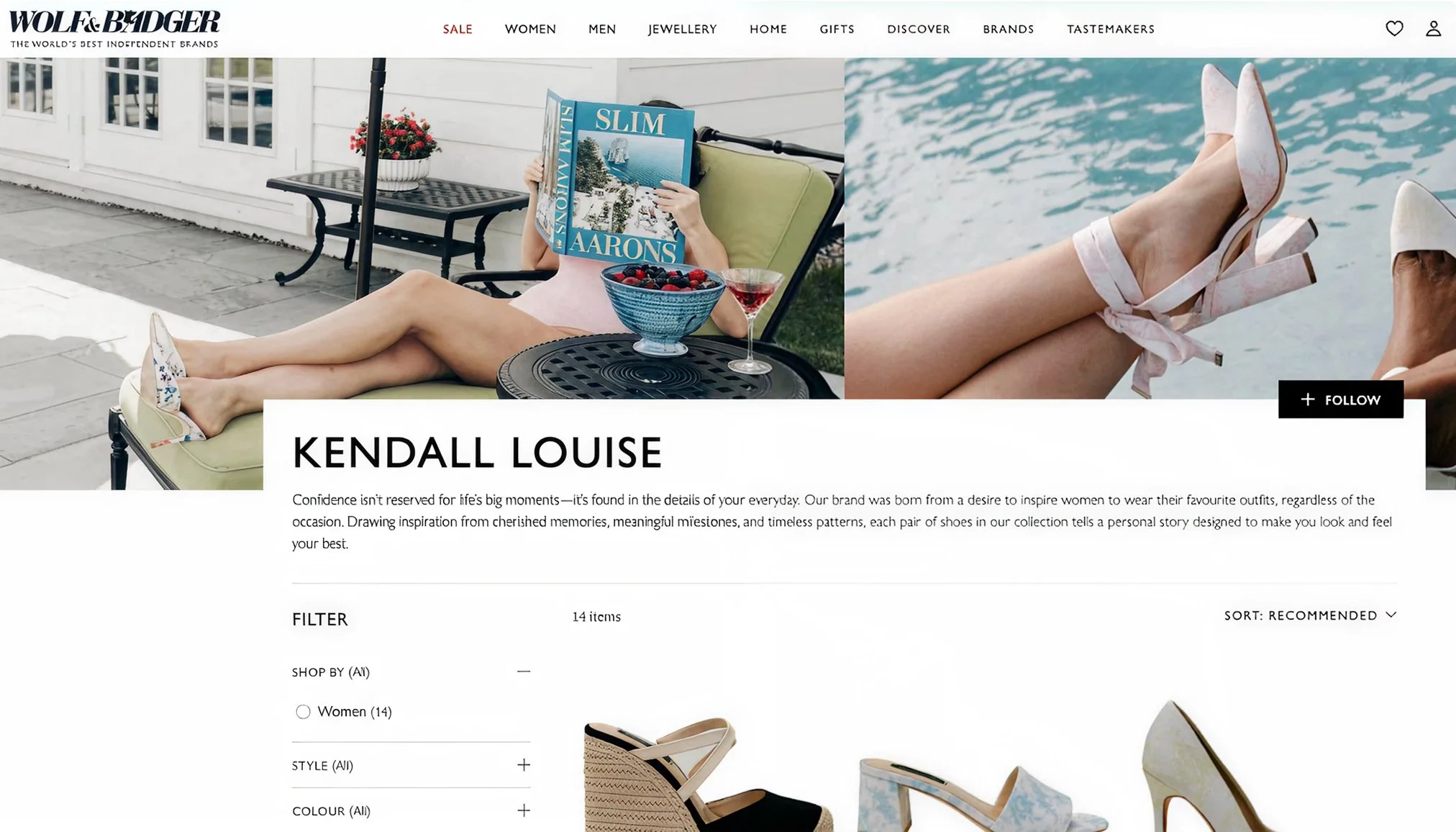
Wolf & Badger offered ethical positioning and catalog depth but lacked a consistent storytelling experience across brands.
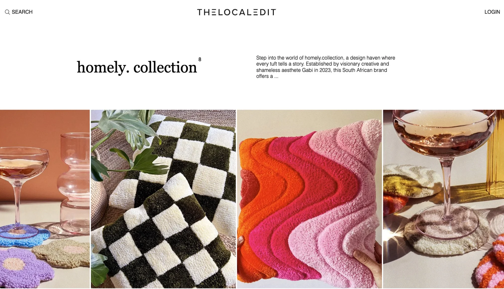
The Local Edit focused on strong local curation but provided little interactive or multimedia depth.
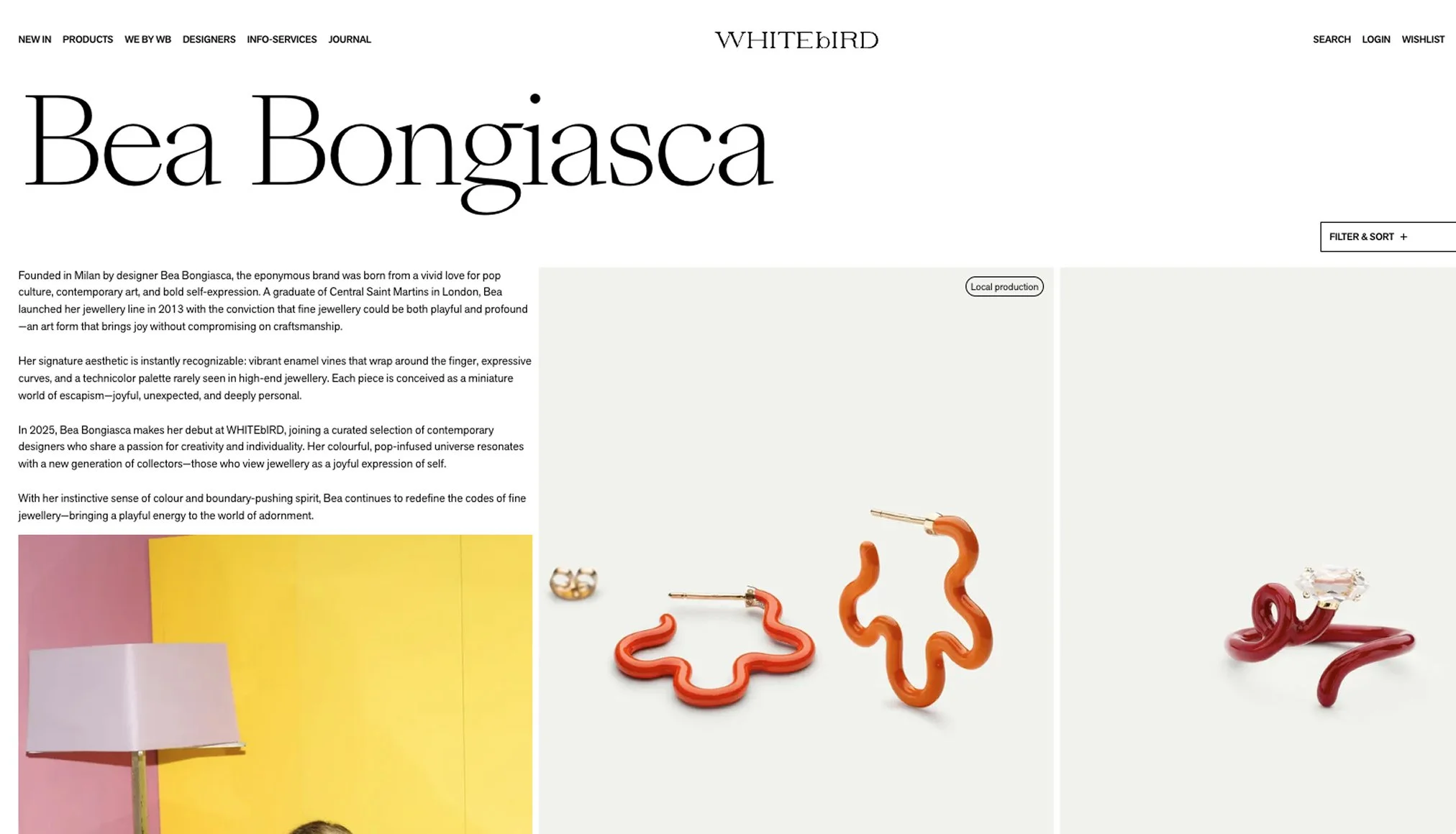
Whitebird offers strong visual curation and a consistent brand aesthetic but provides limited visibility into the creators behind the products.
define
from frustration to pattern
These insights moved into an affinity mapping phase, where scattered frustrations aligned into a clear tension between how users want to engage vs. what current platforms allow.
This tension defined the design goal: create a cohesive experience where creativity, identity, and discovery co-exist in a single place.
framing a values-led alternative

With the core tension identified, the process moved from research synthesis toward structural framing. The discovery phase made it clear that existing platforms prioritise short-form performance at the expense of creative depth.
The next challenge was to define the parameters of an experience that supports identity and allows narratives to unfold over time. This required moving beyond the constraints of typical digital feeds to establish the foundations for a more intentional, human-centric environment.
how might we create a solution that allows designers to document and share their creative process as a core part of their overall brand experience?
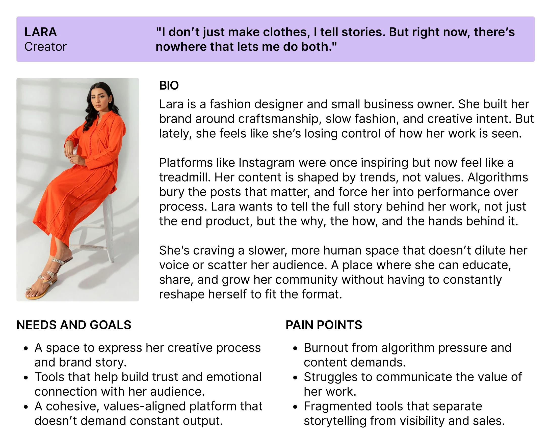
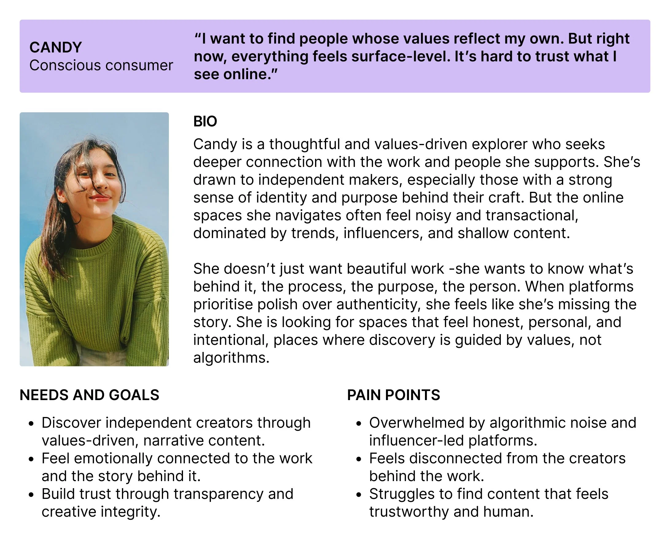
anchoring the design in real user needs
Research synthesis resulted in two primary personas. These archetypes served as strategic anchors throughout the project, ensuring every design decision remained grounded in documented behaviours and motivations.
By filtering product requirements through their specific needs, I was able to prioritise features that balanced creative autonomy for the maker with intentional exploration for the audience.
design
balancing simplicity with narrative depth
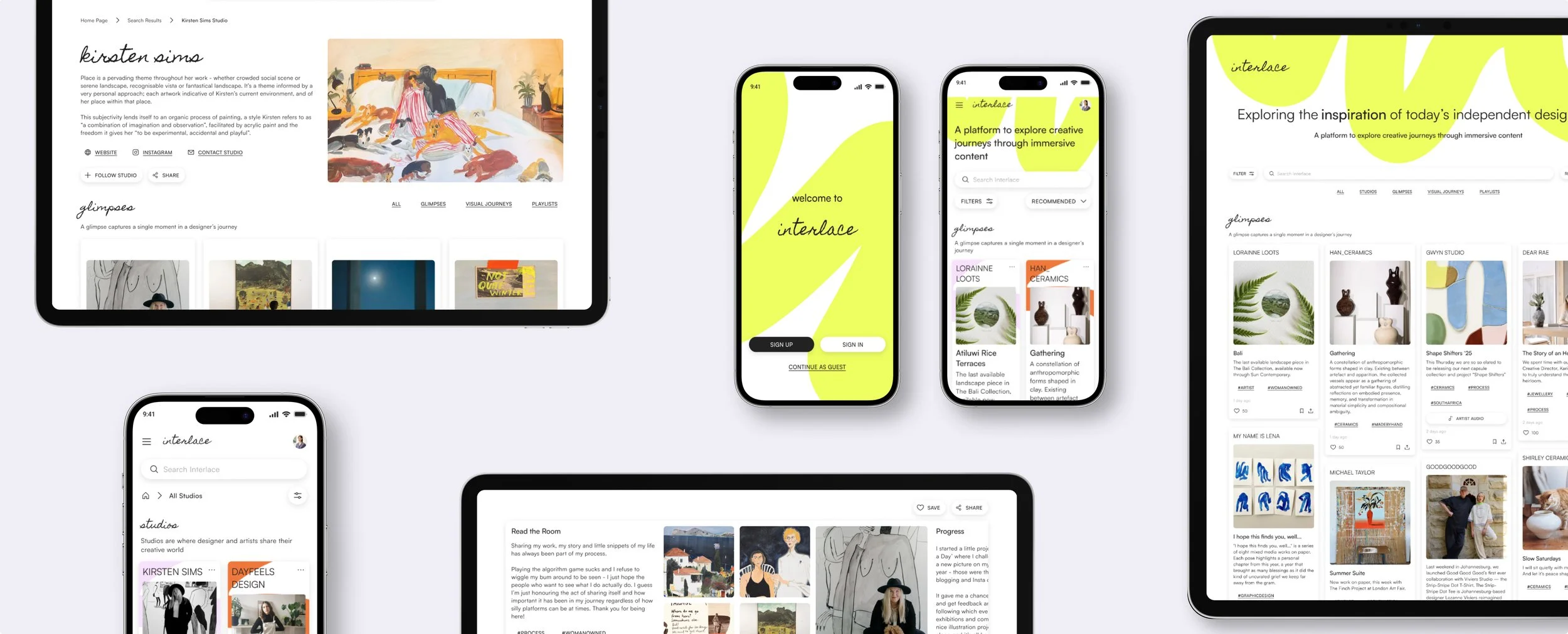
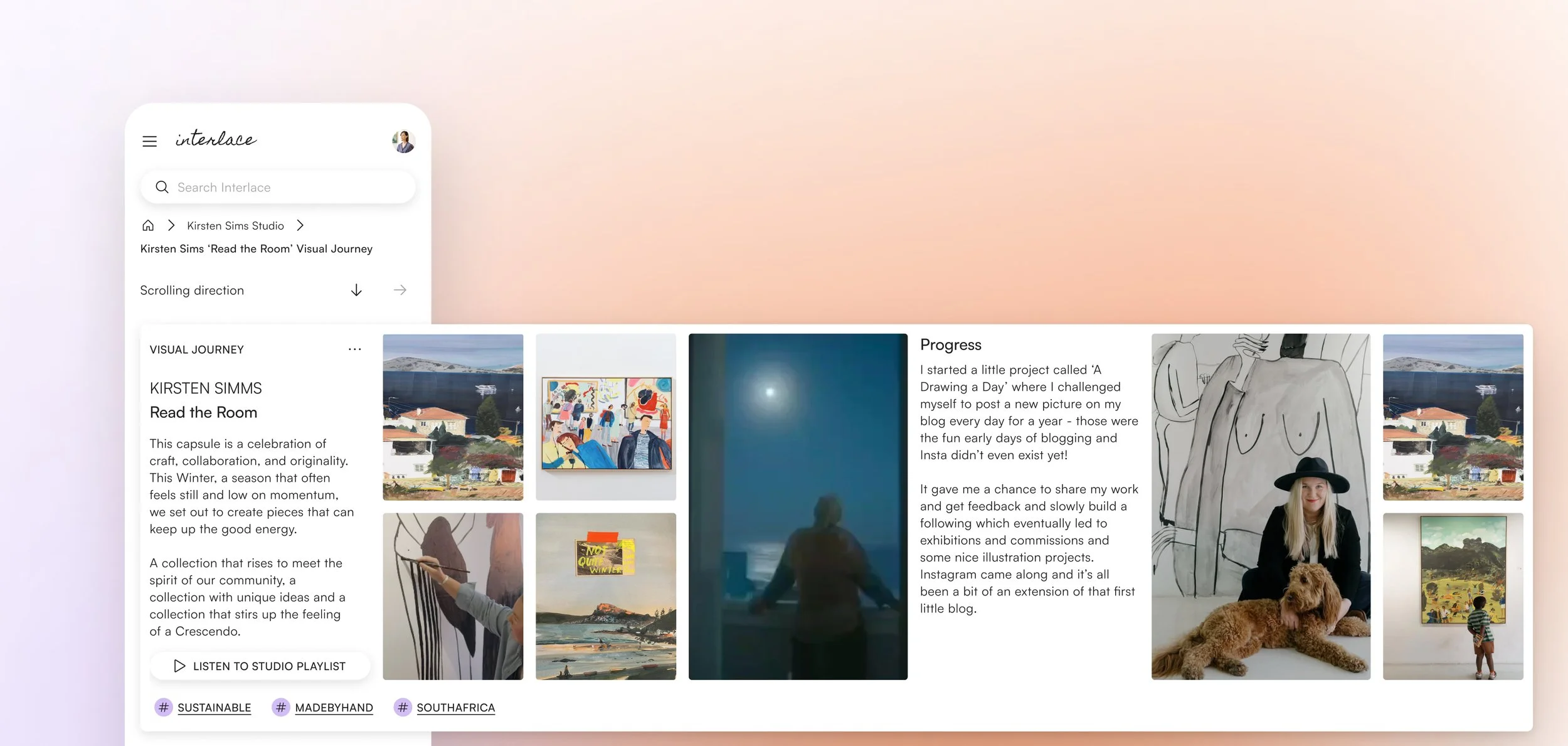
To support a content-heavy ecosystem, the information architecture was designed to feel intuitive rather than overwhelming. The structure focuses on two primary objectives: effortless discovery and immediate access to story-driven content. While many platforms fragment the user journey across feeds and bios, I prioritised a layout that supports intentional browsing and narrative exploration from any entry point.
Due to the project timeline, I made a strategic decision to focus this MVP exclusively on the audience experience, ensuring the discovery journey was seamless before expanding into the creator dashboard.
To ensure users felt grounded, I prioritised persistent orientation. The flow is intentionally light on the surface to encourage browsing, with narrative depth available on demand. By utilising familiar UI patterns, the user’s cognitive load is reduced, allowing the focus to remain on discovery and creator connection.
designing for curiosity without distraction
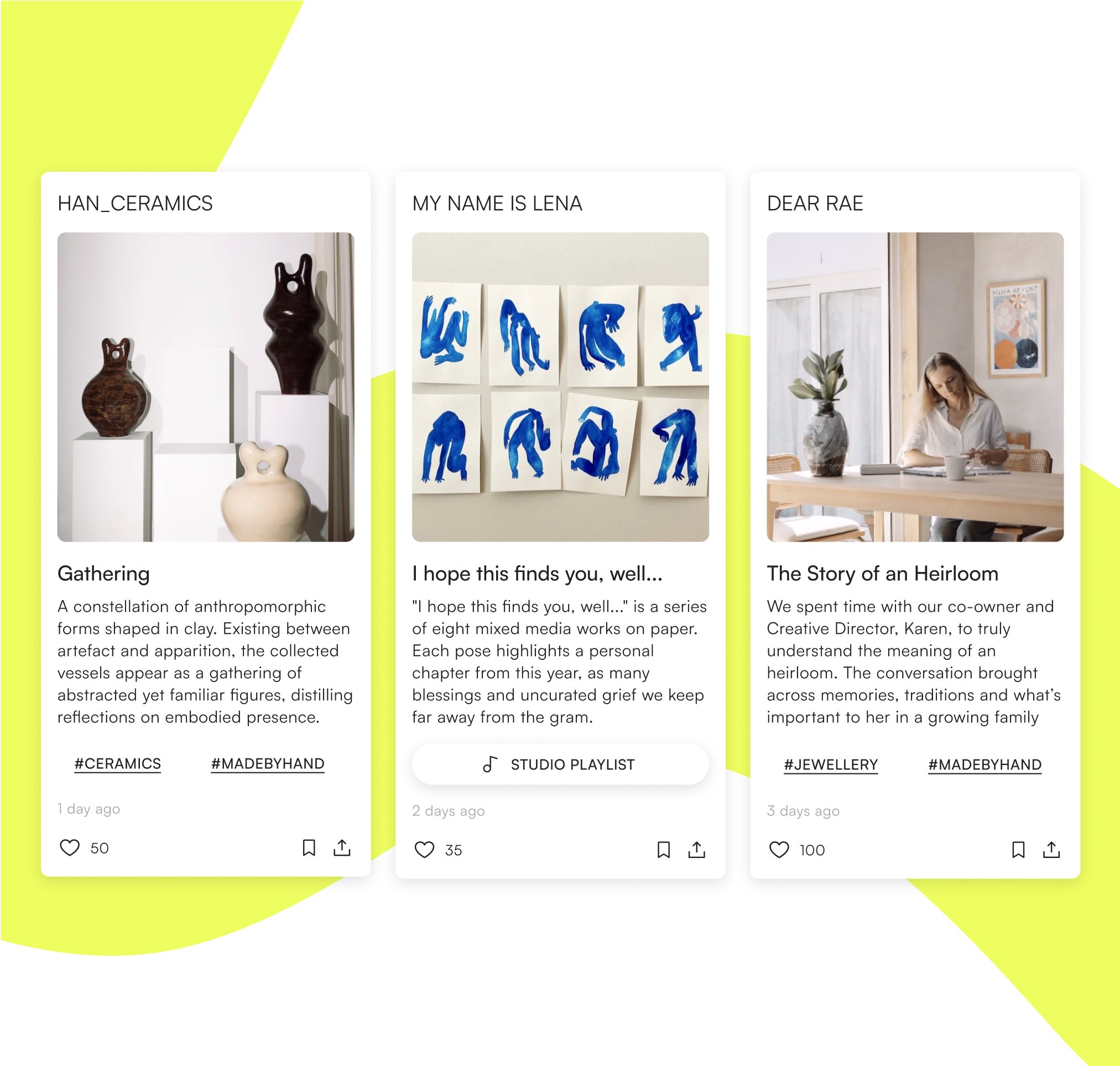
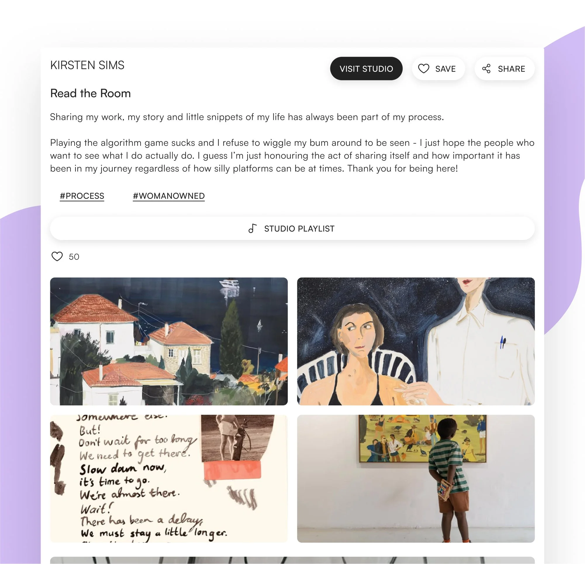
An end-to-end journey from initial onboarding and intent-based search to saving a creator’s story for future engagement.
A journey designed for orientation; ensuring new users can navigate from broad search to deep narrative exploration without losing context.
grounding the experience in mobile-first modularity
Early iterations focused on translating research into a functional structure that prioritised visual-first navigation and space for creative process. Given the projected split between mobile and desktop use, I adopted a mobile-first approach to ensure the core experience remained lean and intuitive before scaling up. By utilising modular, minimal UI elements, I ensured clarity and prevented cognitive overwhelm across all screen sizes.
Group critiques and mentor sessions validated this structural foundation, confirming that the layout was robust enough for initial usability testing.
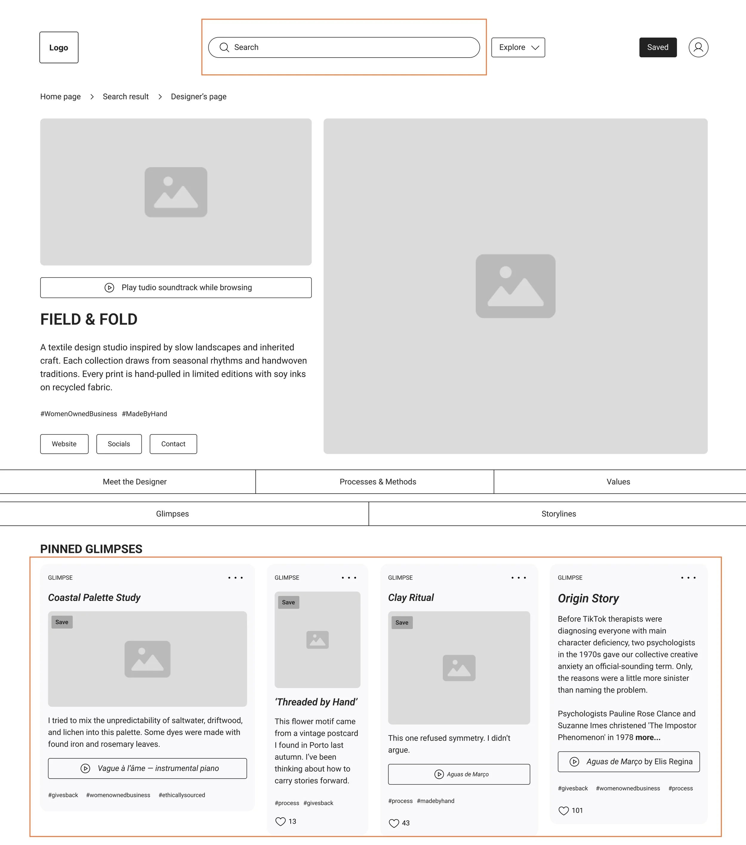
usability testing: refining navigation and platform terminology
I conducted moderated sessions with five participants to evaluate the mid-fidelity prototype, focusing on navigation, terminology, and content discovery.
While the overall response was positive, the sessions revealed critical friction points: users struggled with back-navigation from creator pages, missed the filter placement, and found platform-specific terms like "glimpse" and "storyline" confusing without context.
I prioritised updates based on the frequency and severity of these friction points. By addressing orientation issues and clarifying platform terminology, user confidence was enforced and ensured a smoother, more intuitive first-time platform experience.
Iteration 1:
Home screen navigation
Category selection and filters were moved to the top navigation, where users instinctively looked for them. Tool-tips were introduced to define platform language without being intrusive. Filter panel was rebuilt with search and sort functions to support more user-friendly exploration.
Before usability test
After usability test
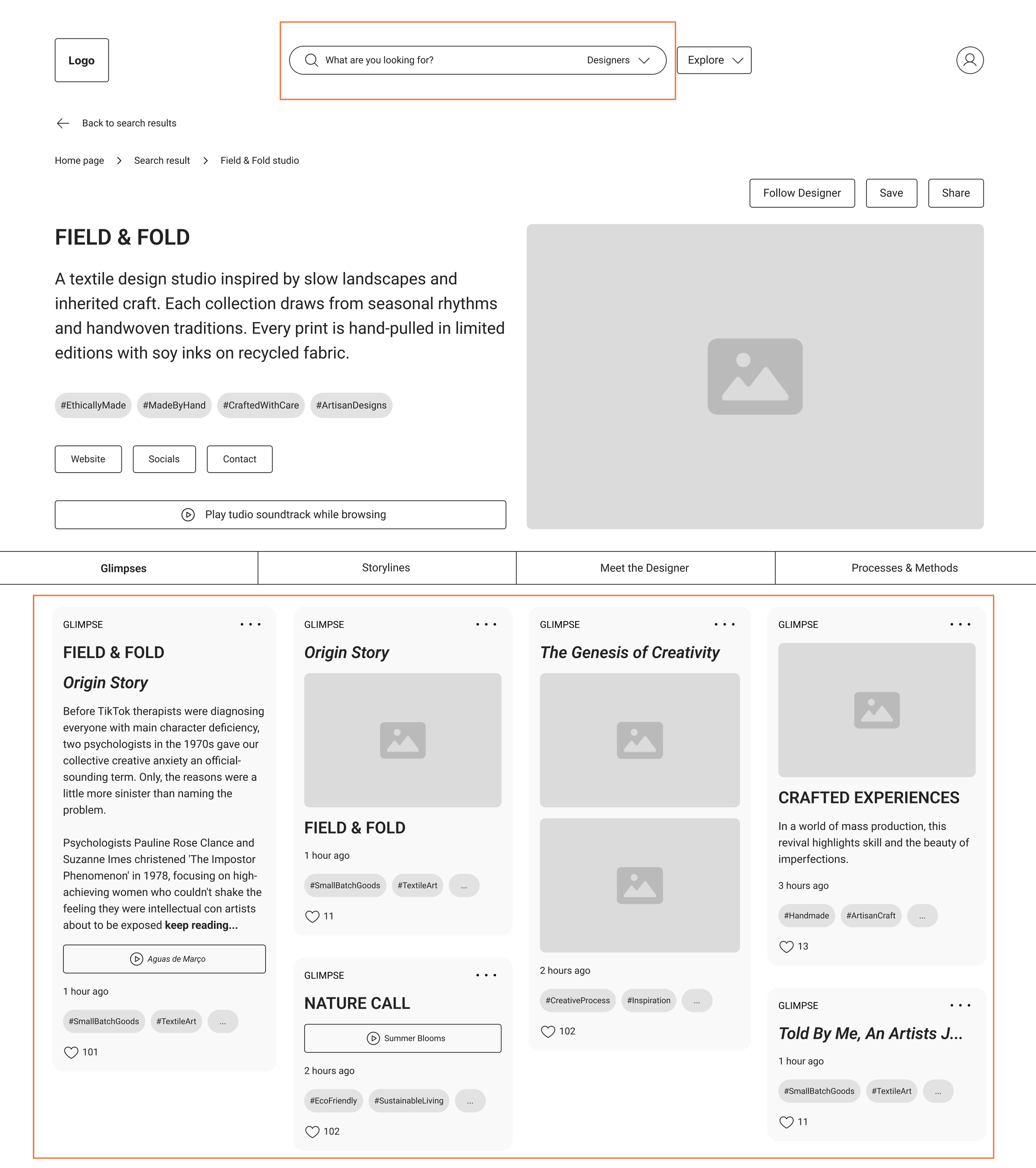
Iteration 2:
Refining the studio page
Studio page was refined to reduce overwhelm and improve navigation. The navigation bar was redesigned for smoother movement between sections, while layout adjustments, including consistent image sizing, improved alignment, and clearer hierarchy.
Before usability test
After usability test
branding with the same care and conviction as its creators
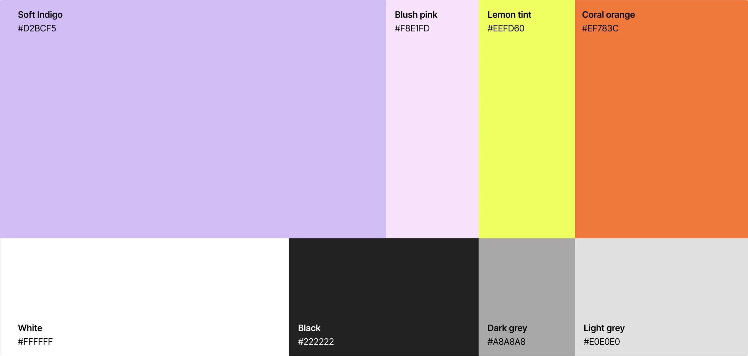
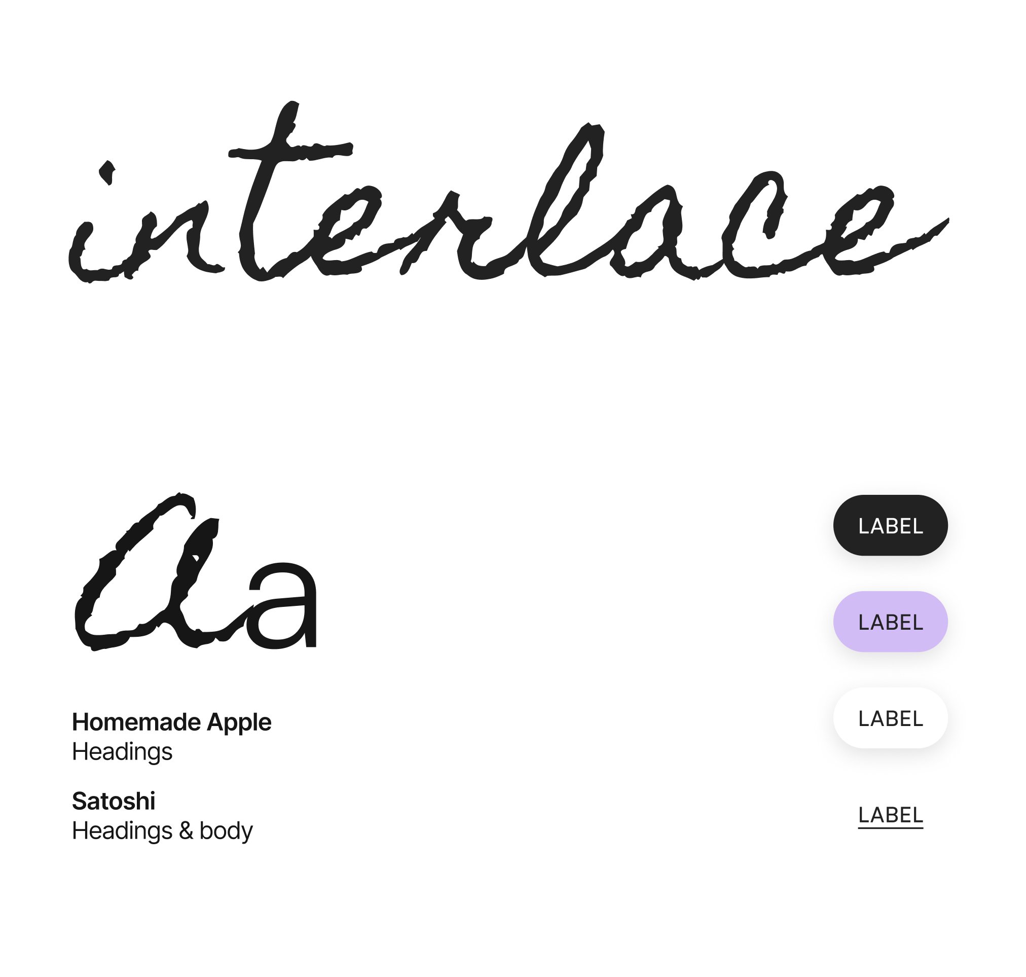
Because interlace was built for an audience with a high visual IQ, the identity had to be as considered as the work it hosts. I drew inspiration from editorial design and photography, utilising a palette of high-energy accents paired with soft neutrals. This balance creates a modern, vibrant atmosphere that remains calm enough to support long-form exploration.
The handwritten logo adds a personal, human quality, while a clean sans-serif typeface provides the necessary structural clarity. This pairing defined the tone of the brand: thoughtful, optimistic, and creatively confident. To ensure the interface never competes with creator content, generous white space and minimal iconography was utilised, keeping the focus entirely on the creator’s work.


high-fidelity testing: prioritising clarity over feature density
Final usability sessions with seven designers and consumers confirmed a strong emotional resonance; participants described the experience as calm and a refreshing departure from algorithm-driven feeds. Testing across desktop and mobile validated the platform’s pacing and low-pressure environment.
Despite the positive reception, the sessions highlighted a need for further functional refinement. Mobile users found horizontal scrolling inaccessible, and platform-specific terminology, specifically "storyline", still required better contextual framing.
The key takeaway was that while the emotional tone was successful, the homepage required clearer signposting for first-time visitors to build immediate confidence and reduce navigation hesitation.
emotional tone landed
7 participants described the experience as calm, curated, and refreshing, a welcome contrast to algorithm-driven platforms.
terminology created friction
6 out of 7 users struggled with the term “storyline,” highlighting a need for simpler language and better in-context definitions.
mobile scroll felt unintuitive
All users praised the horizontal scroll, but found it difficult to use, prompting a need for alternative interactions or stronger visual cues.
Iteration 1:
Onboarding preference selection
Accordion menus were replaced with a full list of visible preferences, removing an unnecessary step and making it easier for users to review and edit their selections. This change simplified the sign-up flow and improved clarity.
Iteration 2:
Homescreen
navigation
The homepage was simplified by adding a clear platform description and refining banner content, and removing redundant category buttons from the search bar.
Iteration 3:
Card redesign
Cards were redesigned to improve clarity and reduce cognitive load. The menu icon was unpacked to show key actions like ‘Save’ and ‘Share’ upfront. The card title was replaced with the Creator’s name to reinforce context. The ‘Explore More’ button was removed, making the card’s purpose and actions more immediate and intuitive.
reflection
balancing creative vision with product reality
This project deepened my understanding that research is not merely a reference point, but the framework within which design must exist. By allowing early user insights to set the boundaries of the product, I was able to resist feature creep and maintain a disciplined focus on what truly mattered. This experience shifted my perspective from exploring what could be built to identifying what needed to be built - transforming the design process from an exercise in possibility into a pursuit of purpose.
Ultimately, Interlace addresses more than a creative gap; it addresses an emotional one. It provides a space where process is visible and identity is felt, closing the distance between creators and their audience.
This project solidified my commitment to shaping how an experience feels, not just how it functions, by crafting digital environments that reflect the same care as the people who inhabit them.
future development
The architecture of Interlace was designed for modularity, providing a robust foundation for future expansion. The immediate roadmap includes:
Creator-facing ecosystem: Developing the dashboard to support multi-format storytelling and process-sharing at scale.
Long-term engagement mapping: Conducting longitudinal studies to observe how creators evolve their narratives over time and how audiences transition from discovery to sustained following.
Accessibility & reach: Refining mobile interaction patterns to ensure the "slow-tech" philosophy remains inclusive and accessible to all users.