
MyMed
easily access and share medical records - securely, and intuitively. anytime. anywhere.
product design・UX research
scope of work
timeline
1 month ・2024
healthcare・mobile app.
project type
overview
improving communication where healthcare systems fall short
Fragmented records and missed information are more than inefficiencies - they create stress, mistrust, and delays in care.
MyMed reimagines how patients and providers share medical information, with a mobile-first experience that makes accessing, storing, and sending records feel simple and secure.
clarity and control when you need it the most.
MyMed allows for quick booking, easy sharing, smarter decisions
on both sides of care.
discover
when systems don’t speak, patients pay the price
Despite the growing number of health platforms, many still feel rigid or impersonal. I studied both competitors and users to understand what’s broken, and what could be reimagined.
Starting with a competitive analysis to explore existing solutions, I then followed up with in-depth user interviews to surface unmet needs and emotional friction points.
what the market offered - and what it missed
I analysed three key competitors, each offering elements like medical record storage, appointment booking, and basic patient portals. Some were restricted to specific regions or healthcare networks, others lacked intuitive UX or failed to integrate patient history across providers.
This analysis revealed a clear opportunity: while many tools focused on functionality, few addressed the emotional weight of navigating care - especially for users on the move, managing chronic conditions, or switching between healthcare systems.
what users needed the most
I interviewed five users (three patients, two practitioners) with the majority based in U.S.A. The challenges they raised, however, reflected a global pattern of fragmented records and limited access across healthcare systems.
Conversations were focused on real-world workflows, frustrations, and expectations to uncover that not just tasks, but feelings, anxiety, confusion, and fatigue were common themes.
key insights that shaped the product
missed appointments are common
Users often forget upcoming visits due to a lack of timely reminders.
no clear need = no adoption
Users with fewer health issues struggle to see the value in managing records digitally.
records are scattered and inaccessible
There’s no central place to store and share records across multiple providers.
healthcare doesn’t travel well
Systems vary across boarders, creating friction for people living abroad or moving between regions.
communication is inefficient
Providers lack tools to collaborate or access essential information quickly.
privacy is a concern, but so is convenience
Users want easy access to their data, but hesitate when platforms feel insecure or opaque.
define
turning pain points into priorities
As I unpacked the findings, it became clear that the core issue wasn’t a lack of digital tools, but rather a lack of connection.
Patients and providers both struggled to access the right information at the right time - creating missed opportunities for effective, human-centred care.
This question quietly guided every design decision - from how users move through the platform to how clearly data is shown, how onboarding feels, and what tone inspires trust.
how might we help patients to easily and securely obtain and store their medical data that they receive from various healthcare providers?
two distinct users, united by a shared frustration
MyMed needed to work for two distinct users:
Patients trying to stay organised and in control
Providers requiring reliable, up-to-date patient information
Through interview insights, it became clear that both groups shared one core frustration: limited access to the information that matters most.
To keep these needs front and centre, two personas were developed to guide the design process.
one journey doesn’t fit all, and the platform had to reflect that
Early interviews made one thing clear: people don’t move through their healthcare in a straight line. Some begin by searching for a provider, others upload test results, and many bounce between tasks based on urgency, stress, or convenience.
This behaviour challenged the idea of a fixed user flow and rather than pushing users down a single path, I designed a flexible structure that let them move through the platform on their own terms.
Throughout the project, i shared my site map in mentor reviews, peer crits, and group feedback sessions. Each round helped me identify what users didn’t need, what could be simplified, and where assumptions needed rethinking. With every iteration, I collapsed unnecessary steps and refined decision points - shaping an architecture that reflects the often non-linear, messy reality of how people manage their care.
patient site map
provider site map
building flows by uncovering where users pause, hesitate, or need reassurance
User flows allowed me to focus on how users think, what choices they face, where they hesitate, and when they need clarity or reassurance. These were key moments where user confidence could be built, or lost.
Mapping these flows helped me test assumptions, simplify decision-making, and align the experience with real user intent.
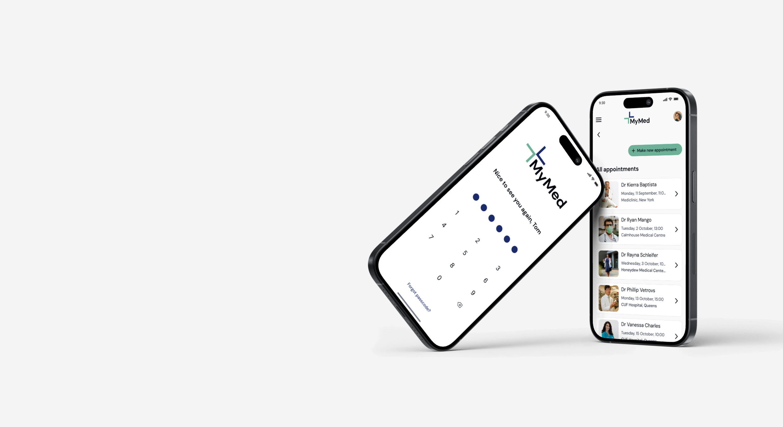
task flow 1: patient makes an appointment and set appointment reminder
task flow 2: patient uploads and shares document with provider
define
I began with low-fidelity wireframes to quickly explore the core user flows: booking appointments and uploading medical records. At this stage, the focus wasn’t on polish but rather about structure, clarity, and validating the foundation of the experience.
These wireframes helped me to understand where users were likely to face unclear paths, repetitive steps, or uncertainty about completed tasks. Keeping things rough and flexible let me explore multiple directions and spot usability issues early, without being distracted by visual polish.
turning complexity into clarity
turning early insights into sharper, more intuitive interactions
With the core flows in place, I moved onto mid-fidelity to focus on clarifying interactions and refining content hierarchy.
Feedback from users, peers, and mentors surfaced specific moments of confusion, guiding several targeted changes to improve ease and flow.
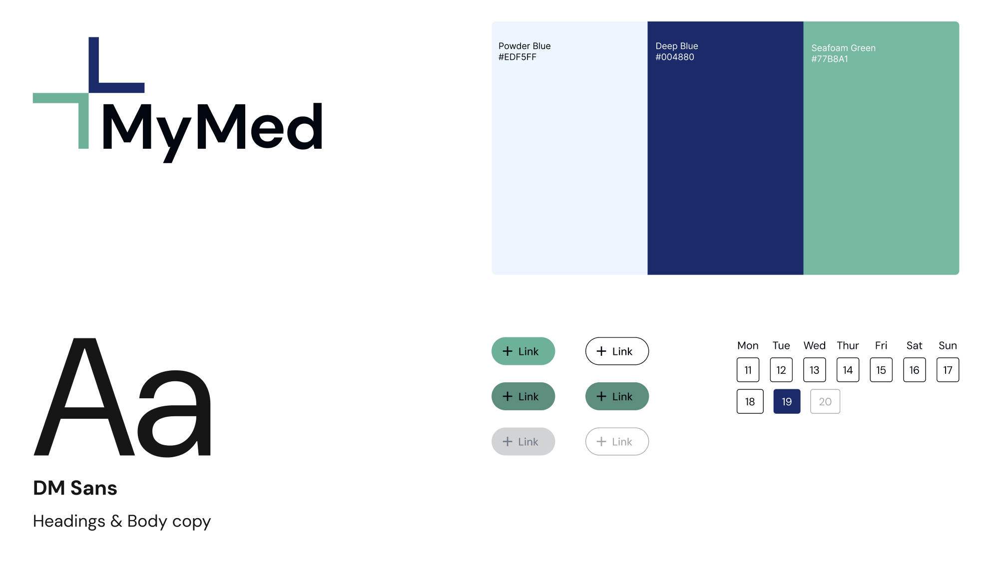
a visual language for reassurance
The visual identity for MyMed was designed to feel calm, credible, and supportive, reflecting the emotional weight of healthcare interactions.
The colour palette was inspired by environments users already associate with care - soft blues, muted neutrals, and clinical whites, chosen to signal trust, reliability, and professionalism without feeling cold or sterile.
The logo takes inspiration from the medical cross, abstracted into two interlocking forms while reflecting MyMed’s core purpose: creating meaningful connection between patients and providers.

translating feedback into design improvements; tightening flows, and removing what gets in the way
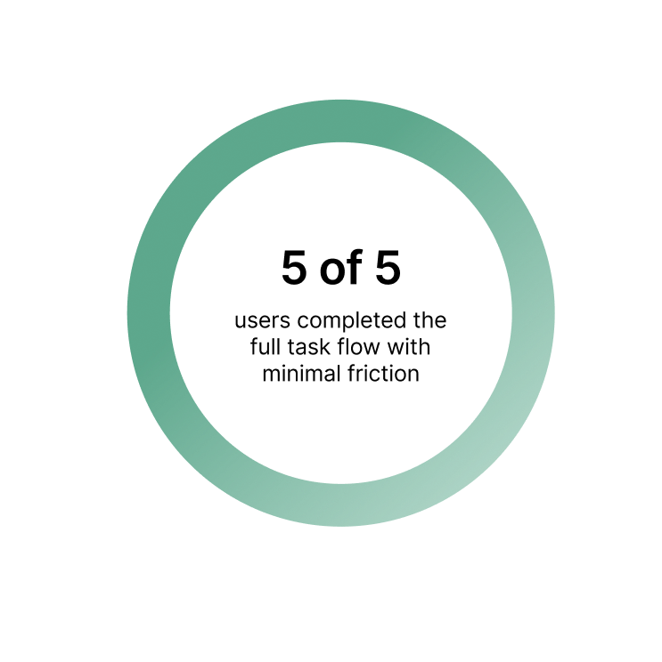
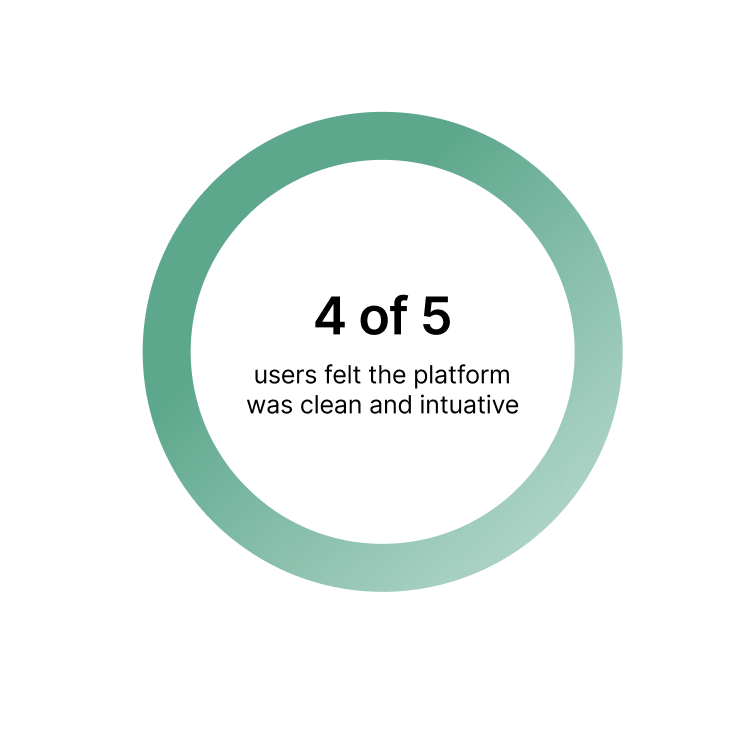
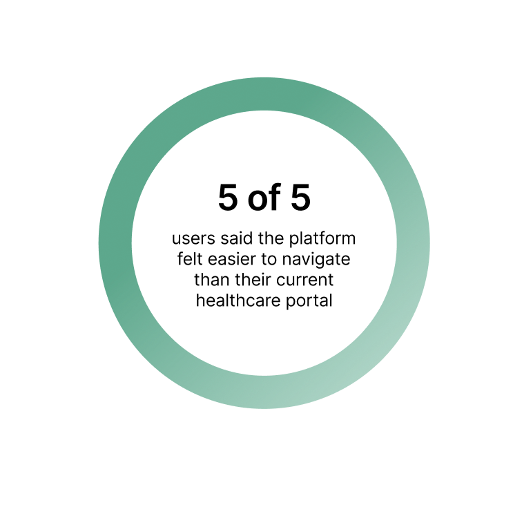
Before moving into high-fidelity, I needed to know if MyMed truly supported users in the moments that matter. I tested key flows with five participants from the target audience.
This round of testing wasn’t just about catching usability bugs. It was about validating the product’s tone, pacing, and clarity: Did the platform feel trustworthy? Did interactions feel effortless or uncertain? The feedback surfaced a strong foundation, but also revealed points of hesitation. In these moments, a small tweak could remove doubt or reinforce understanding.
Each insight became a prompt for refinement, helping me simplify paths and align the product even more closely with user intent before moving on to high fidelity mockups.
Iteration 1:
Adding warmth to the entry point
Some users paused at the login screen and described the platform feeling “a bit clinical” at first glance.
This signalled that the entry point lacked emotional warmth. To counter this, I added a simple welcome message and personalised the screen with the user’s name.
This subtle touch introduced a sense of familiarity and ownership, without compromising the clean, minimal design.
Iteration 2:
Streamlining booking feedback
Users expressed uncertainty about whether their appointment had been confirmed. The standalone confirmation page added an extra step without providing meaningful value causing users to hesitate, unsure what to do next.
To reduce friction and support momentum, I replaced it with a lightweight success toast. This provided instant feedback without disrupting the flow, guiding users directly to the next action: sharing documents with their provider.
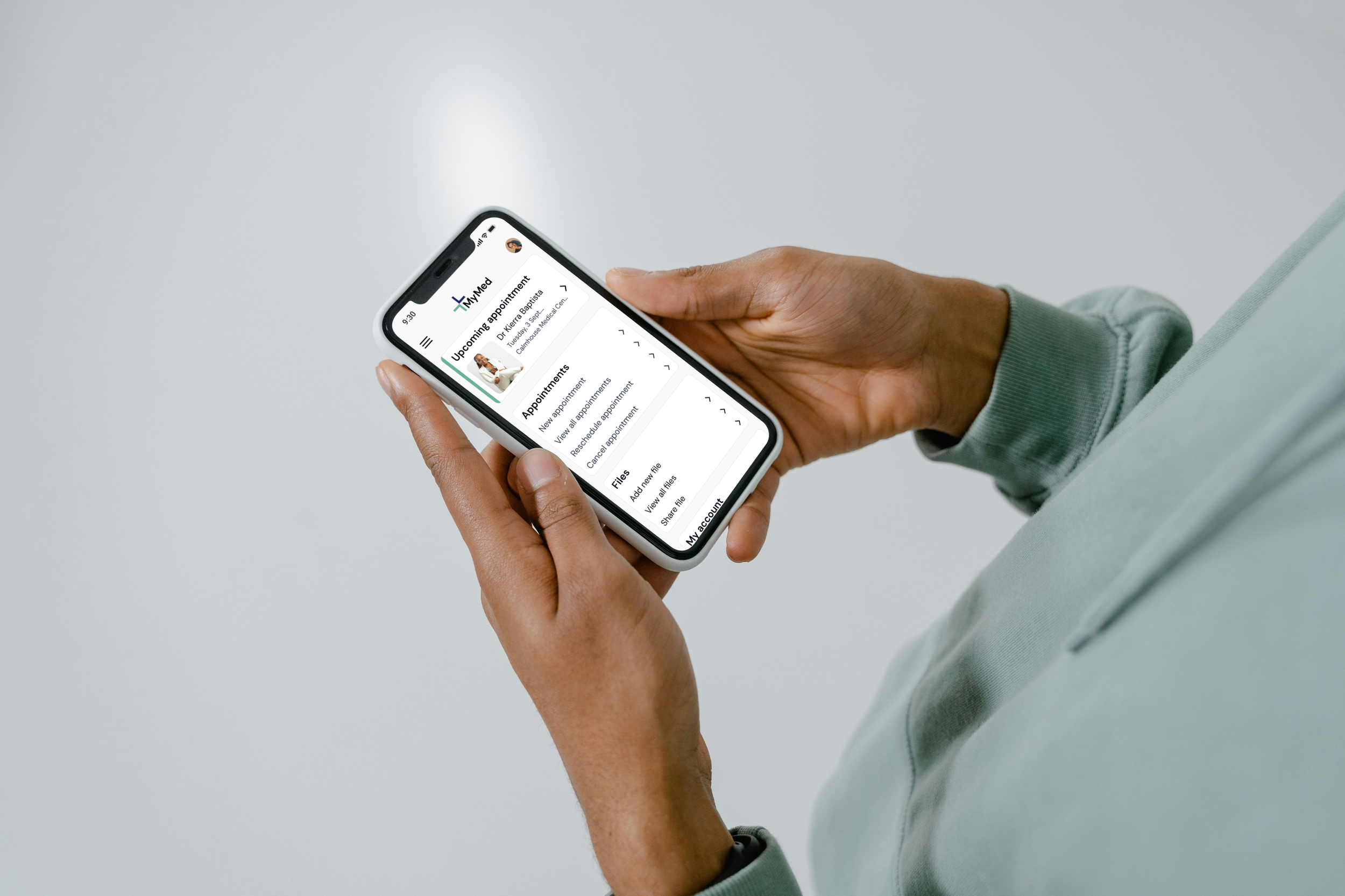
ready for real-world use
The final prototype brings together the research, testing, and iteration done throughout the project.
Tt reflects a design system that’s been tested, refined, and prepared for potential handoff to development.
reflection
a platform grounded in listening
MyMed began as a simple question: how can people feel more in control of their health care? But as I went deeper, I realised that users weren’t just asking for a tool, they were asking for transparency, predictability, and reassurance.
what i took away
I feel proud of where this prototype landed, not just in function, but in tone.
What stayed with me most was how easily people lose momentum when digital systems don’t reflect their reality. I learned to challenge the structure of traditional flows, to prioritise flexibility over rigidity, and to validate assumptions constantly, especially when designing for emotion-laden contexts like healthcare.
future development
If taken further, I’d build out smart integrations: camera scanning for paper records and AI suggestions for routine care.
I’d also test edge cases more rigorously; how the platform performs in lower-trust scenarios, like shared devices or emergency care.
For now, I’m happy to have created a foundation that respects complexity while delivering clarity.