
The Curated Lisbon
Making cultural exploration easier, calmer, and more connected
The client
My role
Duration
Project type
Overview
The challenge
The result
Designing a cultural companion that turns curiosity into action

Discover
Who I spoke to
The Curated Lisbon (uncompleted)
Solo UX / UI designer & Researcher
100 hours, 2025
End-to-end app, Art and Culture
Transforming an Instagram account into a full discovery platform for Lisbon’s creative community
Real users. Real gaps.
6 in-depth interviews
Gave me space to unpack emotions, habits, and frustrations.
Define
Distilling patterns into a challenge worth solving
“By the time I hear about something interesting, it’s already happened.”
- Lucie
“As an expat, I just want to feel included. Some events are amazing, but I don’t know if they are meant for people like me.”
- Wendy
Whether planned or spontaneous, cultural discovery kept falling short
Define
Turning scattered pain points into a single, clear goal: make cultural discovery feel seamless, relevant, and worth acting on
Which features meet real needs while supporting long-term growth?
One system, two journeys
Develop
Balancing clarity, simplicity, and flexibility from the very first screen
User searches for museum opening times
User purchases a pre-saved museum ticket
Where user control meets business impact
With the user flows defined, I moved into low-fidelity sketches to test how the product could support real behaviours. At this stage, I focused on structure, navigation, and pacing, ensuring that the layout reflected how users would naturally explore and act.
I designed around two key principles: minimise effort and maximise clarity. Key details like time, location, and audience were surfaced early to reduce friction and decision fatigue.
A critical layout decision involved balancing map-based vs. list-based browsing. Some users preferred spatial exploration, while others leaned toward scrolling curated events. I explored hybrid layouts to support both modes without fragmenting the experience.
These early sketches helped me validate core decisions, create room for feedback, and build a foundation for future visual refinement.
Polished, purposeful, and ready to scale
Reflection
Empathy-led, outcome-driven
What I took away
Future development
Defining the feature set was about finding the overlap between what users were asking for, and what the platform needed to scale. Research revealed a clear pattern: users were exhausted by fragmented sources and craved clarity, structure, and control in how they plan cultural outings. This wasn’t just about solving pain points, it was about setting the foundation for long-term business growth.
By clustering insights into core themes: discovery, usability, and confidence. I prioritised features that addressed the most high-friction moments in the user journey, supporting both casual explorers and intentional planners.
The MVP focused on five core features: map integration, concise event information, event location, filters and saving events.
Secondary features like reviews and notifications were intentionally deferred to keep the MVP focused, usable, and light, without overbuilding too soon.
Once the features were defined, I mapped out key flows to ensure they reflected not only how users wanted to interact with the product, but also the context in which they’d be using it, often on-the-go, sometimes with intention, sometimes just browsing.
These flows allowed me to pressure-test the clarity of navigation, event information hierarchy, and the overall path to action. I paid close attention to reducing decision fatigue, offering multiple entry points (e.g. via map or list), and making sure that key details such as event time, location, and audience were surfaced without digging.
With a solid foundation from low-fidelity sketches, I moved into mid-fidelity wireframes to bring structure, interaction, and real content into focus. This stage was about pressure-testing whether the product could hold up to both user needs and business goals, before investing in high-fidelity mockups.
Two flows were prioritised early: Ticket purchasing, which tied directly to business goals such as enabling future partnerships, and generating revenue through commissions; and Filtering, which emerged as the most common user pain point and a key differentiator from competitors. Getting this right was essential to reducing decision fatigue and helping users feel in control of their discovery experience. It also laid the groundwork for scalable content models and deeper engagement.
Group critique sessions helped refine how filters were surfaced, and how upfront details like pricing and availability supported faster, more confident decisions.
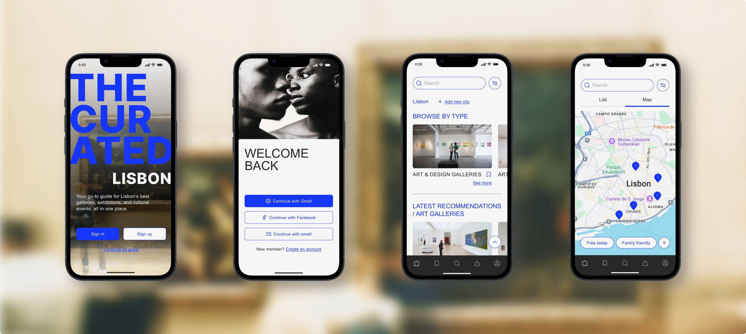
Cultural listing page
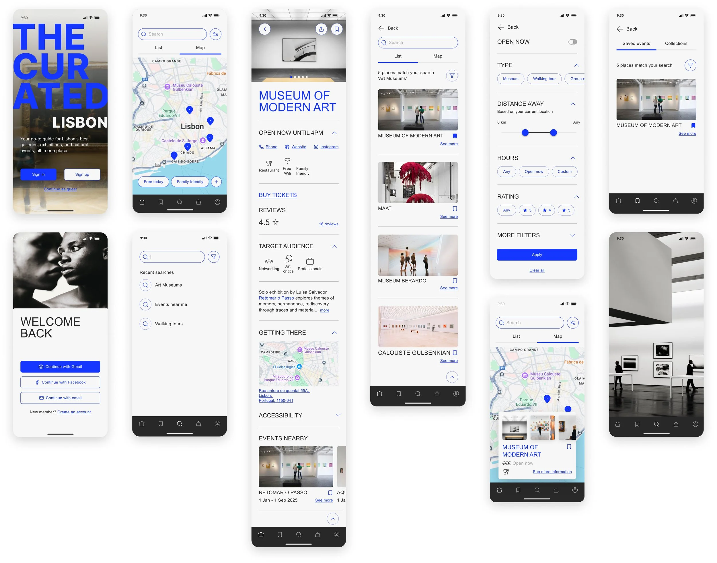
Following user feedback, the event page was refined to improve clarity, usability, and decision-making. Opening times now include more context, with a Closing soon label to help users plan more effectively. The Share and Save icons were moved off the hero image for better visibility and thumb-access, and the bookmark icon was replaced with a heart icon to align with familiar mental models. A social media button was added to allow users to explore events further, a common request during testing. To reduce ambiguity, key filter icons were paired with text labels, and ticket pricing was surfaced directly on the page to help users evaluate events at a glance.
Map page
To improve usability, I added clear Filter and My location icons, and introduced an easy toggle between Map and List views. The bottom Filter bar was simplified, with a clear option to expand for more. The pull-up panel was removed as testing revealed it was consistently overlooked by users.
Filter View
An Open now toggle for easier filtering was included. Filter design was reduced to a more compact and collapsible layout that reduces visual clutter, and clearer groupings of filters like Hours and Rating. The new layout prioritises ease of scanning and thumb-friendly interaction, while redundant or overly detailed categories were removed or consolidated to reduce decision fatigue.
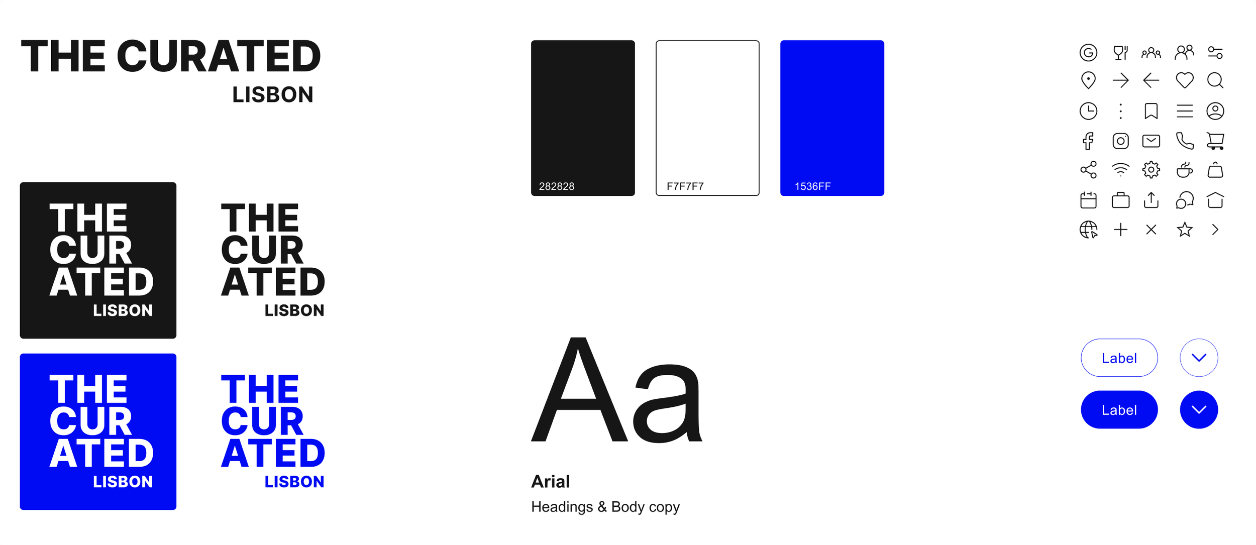
The goal wasn’t just to make the product look good, it was to build a clear, scalable system that let cultural content take the lead. The interface needed to feel editorial yet accessible, expressive - but never overwhelming.
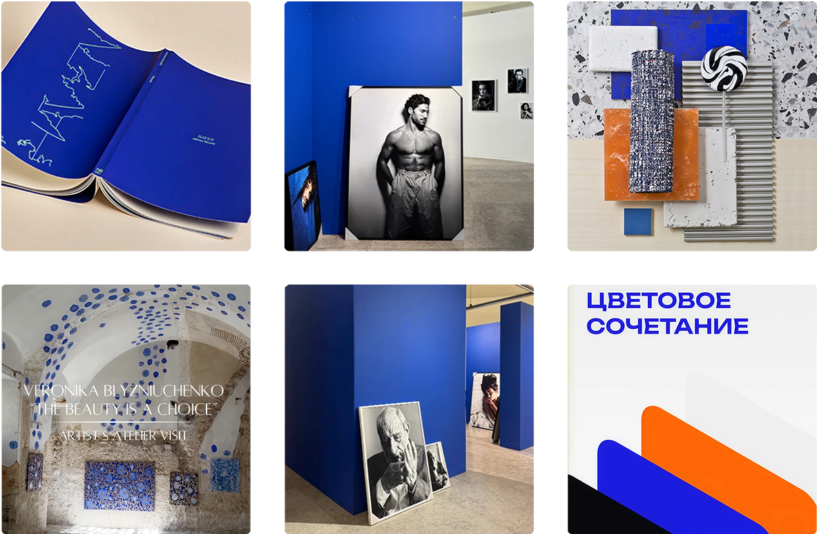
With only a black-and-white logo in place, I had space to expand the brand language. After exploring multiple directions, a bold cobalt blue was introduced to differentiate the product from competitors. It felt confident and modern, while subtle enough to let artwork remain the focus.
The UI leans on white space and careful hierarchy to create clarity and ease. Typography draws from contemporary editorial design, chosen for its balance of readability and refinement. Icons and spacing were designed to be consistent, thumb-friendly, and mobile-first, making the experience feel intentional, elegant, and built to support both daily use and long-term growth.
Testing the high-fidelity prototype revealed that while the core flows were functional, key elements were working harder than they needed to. Users completed both the filtering and ticket purchasing tasks without issue which validated the core structure, but areas of friction showed up around discoverability, clarity, and hierarchy.
What stood out most was how small misalignments added up. The search bar was visually buried on the homepage, filters weren’t recognisable, and key event details like open hours and pricing were pushed too far down the page. These gaps didn’t break the experience, but they slowed the experience and undercut confidence.
This round of testing clarified where the product needed to do more of the heavy lifting, particularly in helping users feel oriented and confident right from the start. These insights also reinforced the business need for repeat usage: if users couldn’t quickly find what they needed, they were less likely to return, share, or purchase tickets.
Because both flows were directly tied to long-term strategy, the updates weren’t just usability tweaks, they were essential for strengthening the product’s role in driving value across both user and business goals.
Improved Usability
Core navigation was simplified to reduce cognitive load. I removed the homepage Map / List toggle, enlarged the Search bar for visibility, and replaced abstract icons (like the three-dot filter and heart save) with clearer, more intuitive alternatives. Making cards fully clickable and introducing a Cart icon brought the purchase flow in line with user expectations and helping to validate a key business goal: a seamless path from discovery to conversion.
Improved layout & visual clarity
Large fonts and excessive spacing were trimmed back to reduce scrolling fatigue and surface key event details earlier. Pricing, open hours, and booking prompts were repositioned higher on the page. I refined content hierarchy, strengthened text contrast, and added opacity behind overlays to help users scan with ease, while maintaining a refined, editorial feel.
The final prototype delivered a user experience that felt both intuitive and intentional, helping users easily filter events, access key details, and plan with confidence.
Each interaction was designed to reduce friction and increase engagement, while supporting core business goals: driving repeat visits, improving content discoverability, and validating future revenue opportunities like ticketing partnerships and premium features.
This project pushed me to think holistically, not just about screens and flows, but about how design connects people to experiences that matter. It sharpened my ability to balance user empathy with business thinking, to design systems that feel both intuitive and strategic.
What mattered most to me was not just building something that worked, but something people would want to return to, something that made cultural discovery feel exciting, not exhausting.
This project challenged me to balance both precision and flexibility, to know when to push forward, and when to pause and ask better questions. Every round of testing peeled back a layer I hadn’t seen before. What looked clear in Figma sometimes confused real people. What I thought was intuitive wasn’t. And that tension wasn’t a setback - that was the work.
What mattered most was designing a system that stayed open to change, to users, to scale. I learned to treat visual design not just as styling, but as structure: a tool for communicating clearly and building trust.
More than anything, this project sharpened how I design: with more empathy, more intention, and more discipline in connecting user needs to business outcomes.
Future development will focus on deepening engagement while opening new opportunities for growth. This includes expanding features that support habit-building, like personalised recommendations, saved collections, and community-led discovery. These additions not only improve user value over time, but also strengthen the platform’s potential for monetisation through exclusive content, early access, and ticketing partnerships.
But any future growth will stay anchored in the core intent: helping people cut through the noise, connect with culture that resonates, and feel confident showing up. Every next step, whether a smarter feed or a stronger network, should make the experience more intuitive, more tailored, and more worth returning to.
The Curated Lisbon had built a dedicated following through its editorial curation of the city’s independent art spaces, but Instagram was becoming a constraint. There was no way to browse events intuitively or plan visits. For the business, this meant lost momentum. For their audience, it meant missed experiences.
There was demand for something more structured: a tool that could carry the brand’s values into a space where users could actually act on their curiosity, not just scroll through it.
Users were jumping between social media, DMs, and outdated blogs to find out what was happening in the city. The challenge was to design a system that offered both editorial curation and practical utility in one cohesive space.
Develop an app that consolidates curated events, gallery profiles, and map-based discovery into a visually refined, editorially-led product.
It not only solves key usability gaps for users, but supports the brand’s transition from Instagram to scalable digital product, creating new opportunities for audience growth, partnerships, and long-term monetisation.
Before diving into the solution, I needed to understand what wasn’t working, and more importantly, why.
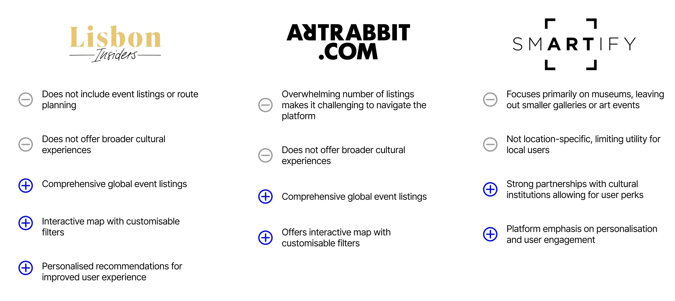
I started by analysing platforms that claimed to help users navigate cultural events, identifying not just feature gaps but deeper problems in positioning and experience. Many tools felt noisy, overly commercial, or lacked the care needed to serve a design-savvy audience.
To balance that perspective, I ran user interviews and surveys with English-speaking professionals and creatives living in Lisbon, the very users that The Curated Lisbon hoped to serve. These were users who cared about art, design, and cultural connection, but were tired of the chaos and friction that came with trying to find what was on.
I learnt that the pain wasn’t just technical - it was emotional.
41 survey responses
Captured broader patterns across users from Portugal, the U.S., and other global cities.
To organise my findings, I ran an affinity mapping session to help me spot the strongest opportunities for design impact. I stepped back and asked: what’s the one challenge that, if solved well, would unlock the most value for both users and the business? While users voiced a wide range of needs, from social connection to premium services, one pain point cut across every conversation: the process of discovering cultural events felt fragmented, unclear, and mentally exhausting.
Whether it was locals overwhelmed by noise, or expats unsure if an event was even meant for them, the frustration was the same “I just want something I can trust that makes planning feel effortless.” They weren’t looking for inspiration; they were looking for a tool that worked.
The selected HMW statement responds to users’ need for clarity and trust, while giving the business a focused foundation for a product that goes beyond content and towards everyday cultural utility. It also gave me a clear lens for prioritising features: if it doesn’t reduce friction or build confidence, it doesn’t belong in the MVP.
“Sometimes I don’t go because I don’t know what kind of crowd will be there. It’s hard to tell from the posts.”
- Paloma
“There’s just too much noise. I keep switching between Instagram, blogs, and Whatsapp groups, it’s exhausting”
- Lucy
Participants
Ranged from ages 25–65, including designers, educators, and art lovers seeking a stronger cultural connection in Lisbon.
“Instagram’s great for inspiration, but not for planning. I need something more structured.”
- Tal
“A map would really help. I want to visually see what’s on and plan my evening around it”
- Ruben
This stage was about translating broad frustrations into a focused product direction. Through affinity mapping, I distilled the findings into insight clusters, surfacing core themes around fragmentation, planning friction, and unclear value.
What users needed wasn’t more content, it was clarity, relevance, and tools that respected how they move through the city.
I landed on a single design challenge: how to make cultural discovery feel less fragmented and more actionable. This became the north star for feature prioritisation, content hierarchy, and every design decision that followed.
How might we design a seamless and engaging platform that reduces friction in cultural discovery - helping users find relevant events, understand their value, and plan with confidence?
Expanding a bare-bones identity into a design language that invites exploration
Clear flows, unclear details: tightening the experience where it mattered most
To ensure every design decision stayed rooted in real user needs, I created two user personas shaped directly from interview insights. While these two users’ behaviours differ, they reflect a shared problem: feeling disconnected from a cultural scene they want to be part of.
These personas helped distil a range of user motivations into two clear lenses, while keeping the product focused on helping users confidently navigate Lisbon’s cultural scene. Thus making discovery feel approachable, purposeful, and tailored to their pace and priorities.